How I designed the Stytch website with developer experience in mind
In November 2020, Stytch hired me to redesign their website and create a visual identity for the brand. It was crucial to the team that the website and the brand experience appeal to Stytch’s target audience of developers—which is how my journey into dark mode began.
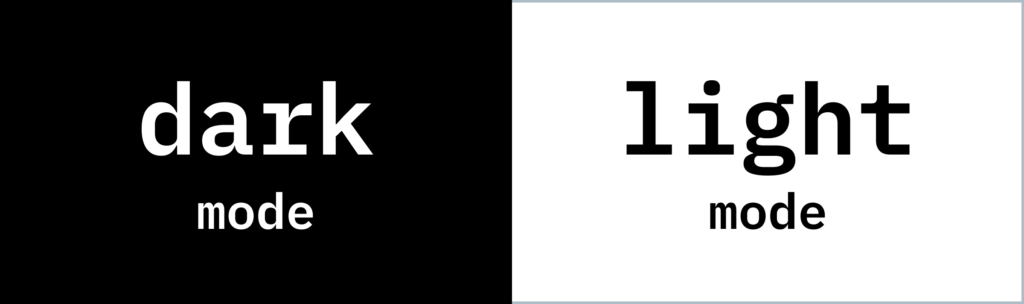
Simply put, designing for dark mode involves creating a dark background with light text and images (like white on black) rather than a light background with dark text and images (like black on white).
For developers constantly viewing minuscule code, dark mode is not only easier on the eyes, it helps them concentrate for longer periods of time. That’s why some surveys have found that a majority of developers—about 70%—prefer dark themes to light ones. As an added benefit, dark mode drains less battery power over time, ultimately reducing a device’s energy consumption.
As I revamped the Stytch website for dark mode, I worked closely with our lead product designer Bingrui Tang to ensure my designs worked equally well across Stytch’s products, so there would be a seamless transition from one platform to another.
Here are a few things I learned—and a few tips I picked up—along the way.
Designing in dark mode is less common than you might think (or hope).
As I began my research, I couldn’t find any examples of other companies that cater to both light and dark mode on their website. While it’s common to encounter a dark mode setting among a company’s products, it’s rarely seen in their branding or on their homepage.
I quickly pivoted to reading articles on dark mode instead. I found Google Design’s “How to design a dark theme using Material” and Chethan KVS’s “The ultimate guide on designing a dark theme for your Android app” to be helpful entry points in understanding the basics of dark mode and learning to design within it effectively.
Designing in dark mode first—and then in light—streamlines the process.
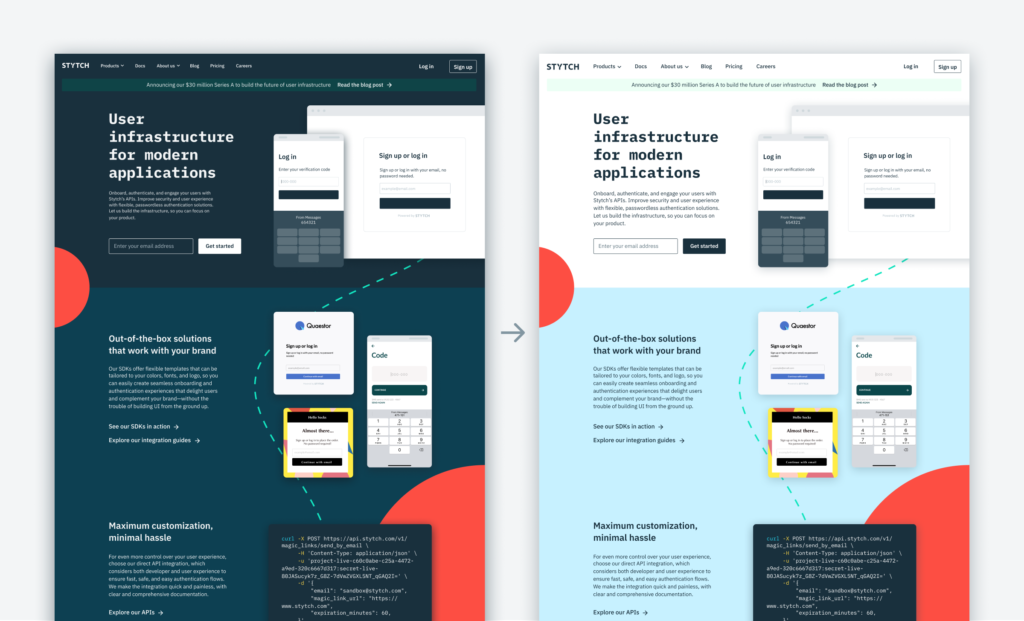
It’s hard for designers to think about the same UI in different configurations, and designing in light and dark modes at the same time can be confusing. On the other hand, when an entire website is already set in light mode, reversing it to dark can take a lot of work—especially as a company grows and its pages and content proliferate.
I found that it was easier to complete one mock-up at a time and that transitioning to light mode was much simpler and more intuitive than transitioning to dark. So I tackled each component—for example, the Stytch homepage—in dark mode and then translated it to light, ironing out the process as I went and saving myself a lot of time and effort.
Drop shadows that work in light mode don’t necessarily work in dark mode—and vice versa.
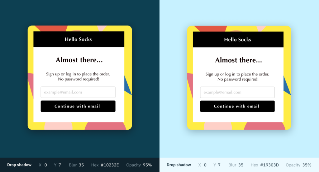
Because it’s difficult to discern shadows against dark backgrounds (as opposed to light), I had to create custom drop shadows as I designed for dark mode—and to add semi-transparent overlays on top of the images and behind the text.
This layering added contrast between surfaces and their shadows, which resulted in more readable elements and allowed the UI to stand out.
Exploring how your brand colors transition between light and dark mode helps create a cohesive and impactful design.


Maintaining a distinctive, consistent color scheme is key to communicating your brand’s identity across UIs and mediums. That may mean tweaking your design standards to include one or two of your brand colors—instead of the whole palette—as you transition from light to dark mode.
Keep in mind that traditional black and grey backgrounds can feel dark and heavy—but they’re not the only option.
For Stytch, I chose a cool, deep blue for our dark mode theme to mix it up and try something a bit different. It’s worth experimenting with a variety of alternative background colors and configurations while staying true to your brand flavor to see which has the crispest definition and best showcases your content in dark mode.
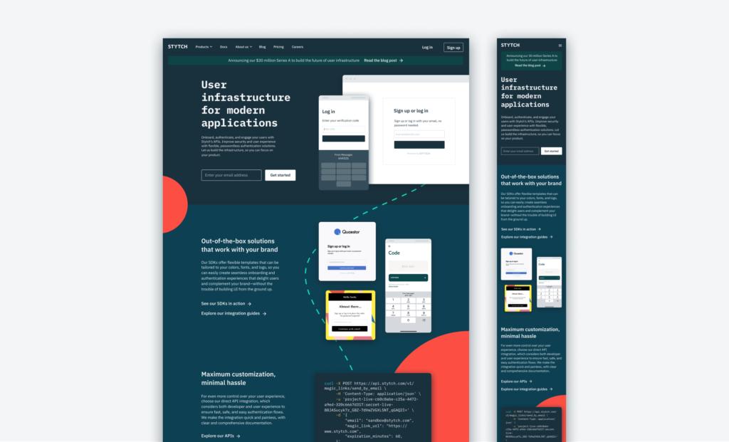
If designing for web, do an early accessibility and responsiveness test so you don’t have to rework your dark mode system before development.
When selecting a dark mode color scheme, I was initially drawn toward white on black as an easy and accessible option. When I transitioned to blue, that meant going in and testing lighter shades of type to make sure they stood out—and occasionally picking darker or lighter hues on either side to ensure maximum readability.
When it comes to dark mode, it’s also important to build out mocks in both desktop and mobile (known as responsive design) to see how dark your colors become at a smaller scale. Keep in mind, a color scheme can change dramatically depending on the amount of space it fills. Generally, the smaller the space, the darker the appearance. I found this tool to be very useful as I mastered these proportions.
Key takeaways
Designing in dark mode is a great way not only to delight developers but to communicate that you care about your users’ experience.
I hope the lessons I took away from setting up Stytch’s website for dark mode can be a helpful resource for other designers in the field and set them up for success.
Check out the website in both modes
Mac users: System Preferences > General > Appearance
PC users: Settings > Personalization > Colors
Our design team is growing!
Interested in bringing your skills to Stytch? Check out our open product design position.
SHARE