> ## Documentation Index
> Fetch the complete documentation index at: https://stytch.com/docs/llms.txt
> Use this file to discover all available pages before exploring further.
# Admin Portal SSO
> SSO configuration and management in the Admin Portal Prebuilt UI Components
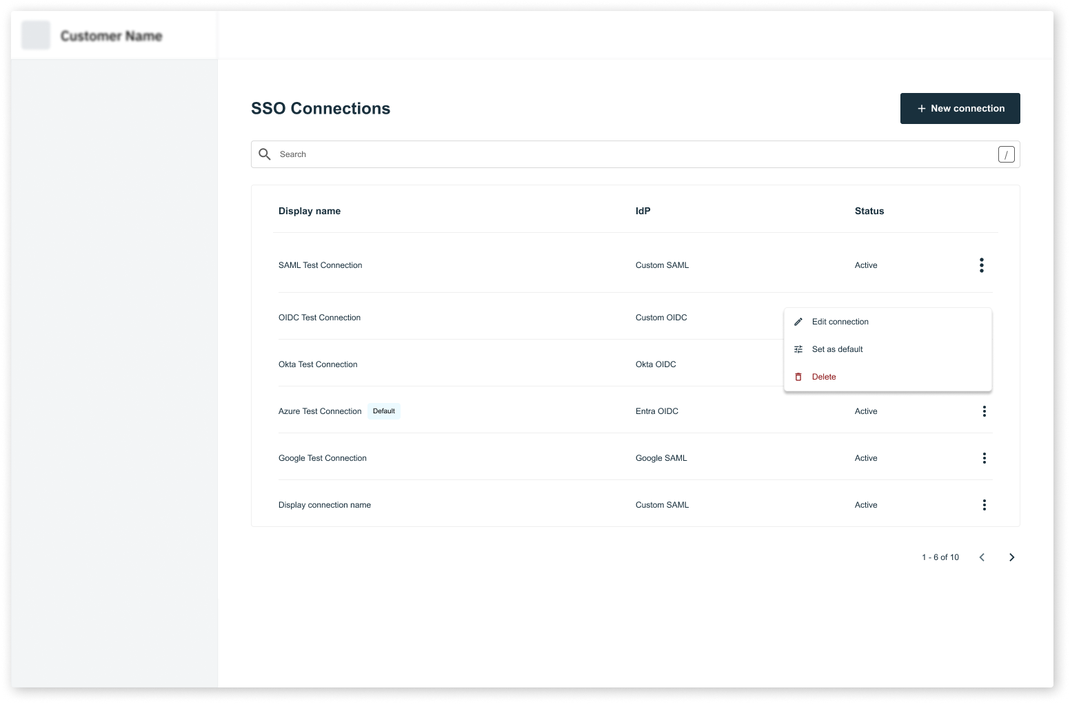
`AdminPortalSSO` is a drop-in component for the Organization settings page in your application. It allows Organization Members with the required RBAC roles (ie. `admin`) to manage SSO connections for their Organization.
`AdminPortalSSO` must be wrapped inside a `StytchB2BProvider`. Take a look at our [installation guide](../../installation) for more information on how to configure the `StytchB2BProvider` for your framework.
 ## Props
The style configuration allows you to customize the look of the Admin Portal. You can specify some of them or none at all. We'll use our defaults for the ones you don't specify.
The configuration object for the Admin Portal container.
The background color of the Admin Portal container.
The border color of the Admin Portal container.
The border radius of the Admin Portal container.
The width of the Admin Portal container.
The configuration object for colors used in the Admin Portal.
Your primary brand color. This will be applied to most of the text in the Admin Portal.
Your secondary brand color. This will be applied to text disclaimers and other visual elements.
A success color to be used in visual elements.
An error color to be used in visual elements.
The text color for accent elements. This will be used for tags and select chips in the Admin Portal.
An accent color to be used in visual elements. This will be applied to the background of tags and select chips in the Admin Portal.
The color used for miscellaneous elements that don't require visual elements, like dividers and table, popover menu, and accordion borders.
The configuration object for buttons in the Admin Portal.
The configuration object for primary buttons.
The background color of the primary button.
The text color of the primary button.
The border color of the primary button.
The border radius of the primary button.
The configuration object for secondary buttons.
The background color of the secondary button.
The text color of the secondary button.
The border color of the secondary button.
The border radius of the secondary button.
The configuration object for disabled buttons.
The background color of the disabled button.
The text color of the disabled button.
The border color of the disabled button.
The border radius of the disabled button.
The configuration object for text inputs in the Admin Portal.
The background color of the text inputs.
The text color of the text inputs.
The color of the placeholder text in the text inputs.
The border color of the text inputs.
The border radius of the text inputs.
The font family that will apply to text in the Admin Portal.
The default border radius for elements in the Admin Portal.
The configuration object for the Admin Portal SSO UI.
A function that returns the display name for a role. By default, the `role.role_id` is used as the display name.
A function that returns the description for a role. By default, the `role.description` is used as is.
A function that determines the sort order of the roles. Returns a list of role IDs in the desired order.
The URL used when testing SSO connections via the test button on the SSO Connection Details screen. If this value is not passed, the default `login_redirect_url` that you set in your Dashboard is used.
The URL used when testing SSO connections via the test button on the SSO Connection Details screen. If this value is not passed, the default `signup_redirect_url` that you set in your Dashboard is used.
```jsx theme={null}
import { AdminPortalSSO } from "@stytch/nextjs/b2b/adminPortal";
const styles = { fontFamily: "Arial" };
const SSOPage = () => {
return ;
};
export default SSOPage;
```
## Props
The style configuration allows you to customize the look of the Admin Portal. You can specify some of them or none at all. We'll use our defaults for the ones you don't specify.
The configuration object for the Admin Portal container.
The background color of the Admin Portal container.
The border color of the Admin Portal container.
The border radius of the Admin Portal container.
The width of the Admin Portal container.
The configuration object for colors used in the Admin Portal.
Your primary brand color. This will be applied to most of the text in the Admin Portal.
Your secondary brand color. This will be applied to text disclaimers and other visual elements.
A success color to be used in visual elements.
An error color to be used in visual elements.
The text color for accent elements. This will be used for tags and select chips in the Admin Portal.
An accent color to be used in visual elements. This will be applied to the background of tags and select chips in the Admin Portal.
The color used for miscellaneous elements that don't require visual elements, like dividers and table, popover menu, and accordion borders.
The configuration object for buttons in the Admin Portal.
The configuration object for primary buttons.
The background color of the primary button.
The text color of the primary button.
The border color of the primary button.
The border radius of the primary button.
The configuration object for secondary buttons.
The background color of the secondary button.
The text color of the secondary button.
The border color of the secondary button.
The border radius of the secondary button.
The configuration object for disabled buttons.
The background color of the disabled button.
The text color of the disabled button.
The border color of the disabled button.
The border radius of the disabled button.
The configuration object for text inputs in the Admin Portal.
The background color of the text inputs.
The text color of the text inputs.
The color of the placeholder text in the text inputs.
The border color of the text inputs.
The border radius of the text inputs.
The font family that will apply to text in the Admin Portal.
The default border radius for elements in the Admin Portal.
The configuration object for the Admin Portal SSO UI.
A function that returns the display name for a role. By default, the `role.role_id` is used as the display name.
A function that returns the description for a role. By default, the `role.description` is used as is.
A function that determines the sort order of the roles. Returns a list of role IDs in the desired order.
The URL used when testing SSO connections via the test button on the SSO Connection Details screen. If this value is not passed, the default `login_redirect_url` that you set in your Dashboard is used.
The URL used when testing SSO connections via the test button on the SSO Connection Details screen. If this value is not passed, the default `signup_redirect_url` that you set in your Dashboard is used.
```jsx theme={null}
import { AdminPortalSSO } from "@stytch/nextjs/b2b/adminPortal";
const styles = { fontFamily: "Arial" };
const SSOPage = () => {
return ;
};
export default SSOPage;
```