> ## Documentation Index
> Fetch the complete documentation index at: https://stytch.com/docs/llms.txt
> Use this file to discover all available pages before exploring further.
# @stytch/vanilla-js v5
> Documentation for vanilla-js v5
The following only apply to @stytch/vanilla-js v5 and below. We recommend upgrading to v6 to receive new features by following [the upgrade guide](/api-reference/b2b/frontend-sdks/vanilla-js/upgrade-guide).
This page documents old APIs used in @stytch/vanilla-js v5. APIs not described on this page are unchanged in v6.
## StytchB2BUIClient and StytchB2BHeadlessClient
If you are using Stytch UI, use `StytchB2BUIClient`, otherwise use `StytchB2BHeadlessClient` from `@stytch/vanilla-js/b2b/headless` for smaller bundle size.
```js theme={null}
// For Stytch UI
import { StytchB2BUIClient } from '@stytch/vanilla-js/b2b';
// Without Stytch UI
import { StytchB2BHeadlessClient } from '@stytch/vanilla-js/b2b/headless';
```
### Imports
These imports are only available in `@stytch/vanilla-js/b2b` in v5 and should be imported separately from `@stytch/react` or `@stytch/nextjs`.
* `B2BProducts`
* Types for most SDK methods and configuration
## Mounting
If you are using React or Next.js, pass the `StytchB2BUIClient` into ``.
```jsx theme={null}
// Your app here
```
If you are only using `@stytch/vanilla-js`, use the `mount` functions on the client. `elementId` is a selector matching an element on the page to mount Stytch UI to. Make sure this element is included in your HTML file before the script tag containing your Stytch configuration.
```js theme={null}
// Stytch login
stytch.mount({
elementId: '#stytch-sdk',
styles,
callbacks,
config,
strings,
});
// Stytch identity provider
stytch.mountIdentityProvider({
elementId: '#stytch-idp-container',
styles,
});
```
## Styles
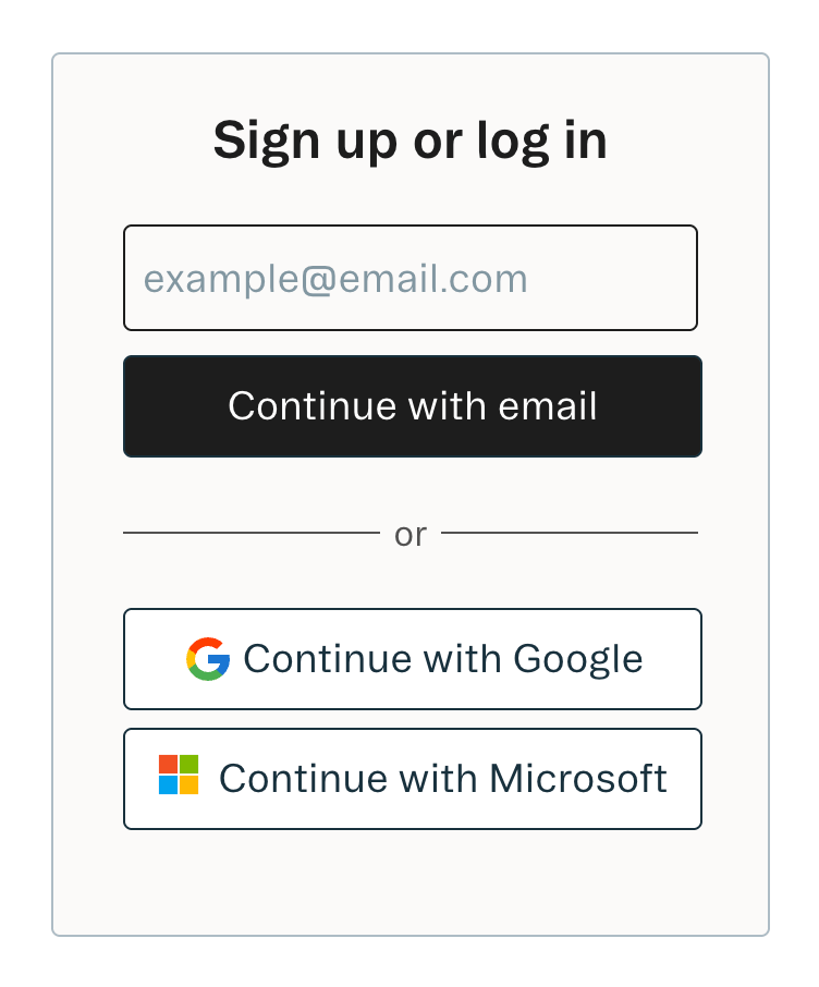 The style object allows you to customize the look of the SDK. You can specify
some of them or none at all. We'll use our defaults for the ones you don't
specify.
The font family that will apply to all text in the SDK.
When this value is true, the title and description text will not show in the SDK.
The configuration object for the Stytch UI container.
The width of the SDK container.
The background color of the SDK container.
The border color of the SDK container.
The configuration object for colors used in the Stytch UI components.
Your primary brand color. This will be applied to most of the text in the SDK.
Your secondary brand color. This will be applied to text disclaimers and other visual elements.
A success color to be used in visual elements.
An error color to be used in visual elements.
The configuration object for buttons in the Stytch UI component.
The configuration object for primary buttons.
The text color of the primary button.
The background color of the primary button.
The border color of the primary button.
The border radius of the primary button.
The configuration object for secondary buttons.
The text color of the secondary button.
The background color of the secondary button.
The border color of the secondary button.
The border radius of the secondary button.
The configuration object for text inputs in the Stytch UI components.
The text color of the text inputs.
The background color of the text inputs.
The color of the placeholder text in the text inputs.
The border color of the text inputs.
The border radius of the text inputs.
The configuration object for your custom logo.
The URL of your custom logo. The image will be resized to fit a max height of 50px, and a max width of 100px.
The style object allows you to customize the look of the SDK. You can specify
some of them or none at all. We'll use our defaults for the ones you don't
specify.
The font family that will apply to all text in the SDK.
When this value is true, the title and description text will not show in the SDK.
The configuration object for the Stytch UI container.
The width of the SDK container.
The background color of the SDK container.
The border color of the SDK container.
The configuration object for colors used in the Stytch UI components.
Your primary brand color. This will be applied to most of the text in the SDK.
Your secondary brand color. This will be applied to text disclaimers and other visual elements.
A success color to be used in visual elements.
An error color to be used in visual elements.
The configuration object for buttons in the Stytch UI component.
The configuration object for primary buttons.
The text color of the primary button.
The background color of the primary button.
The border color of the primary button.
The border radius of the primary button.
The configuration object for secondary buttons.
The text color of the secondary button.
The background color of the secondary button.
The border color of the secondary button.
The border radius of the secondary button.
The configuration object for text inputs in the Stytch UI components.
The text color of the text inputs.
The background color of the text inputs.
The color of the placeholder text in the text inputs.
The border color of the text inputs.
The border radius of the text inputs.
The configuration object for your custom logo.
The URL of your custom logo. The image will be resized to fit a max height of 50px, and a max width of 100px.