> ## Documentation Index
> Fetch the complete documentation index at: https://stytch.com/docs/llms.txt
> Use this file to discover all available pages before exploring further.
# Identity Provider Configuration
> Configure Stytch as an identity provider using the Stytch Next.js SDK
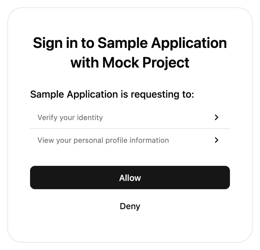 The `IdentityProvider` component is used to enable the logged-in User to perform an OAuth Authorization flow with a pre-registered Connected App. The UI component will automatically parse out OAuth related fields from the query params, such as `client_id`, `redirect_uri`, `scope`, and `state`.
The User must be logged in before this component is rendered.
For an overview of when consent is required, see our [Consent Management guide](/connected-apps/resources/consent-management).
## Props
The `presentation.theme` object allows you to customize the look of the SDK. You can specify some of them or none at all. We'll use our defaults for the ones you don't specify.
If you pass in an array of two themes, the first will automatically be used when the user's OS is in light mode, and the second in dark mode.
See [our pre-built themes](../theming#pre-built-themes), [how to write your own theme](../theming#creating-your-own-theme) or [reference for all properties](../theming#reference).
The `presentation.options` object customizes non-style related aspects of the SDK's appearance.
You can specify some of them or none at all. We'll use our defaults for the ones you don't specify.
When this value is true, the title and description text will not show in the SDK.
The configuration object for your custom logo.
The URL of your custom logo.
The alt text for the logo for non-visual users. This is required for accessibility.
Allows our icons to be overridden. See [icon customization guide](../theming#icon-customization) for more information.
Optional callbacks that are triggered by various events in the SDK. See more details about the callbacks [here](/api-reference/consumer/frontend-sdks/react/prebuilt-ui/identity-provider/callbacks).
A callback function that responds to events sent from the SDK.
A callback function that responds to errors in the SDK. It is useful for debugging during development and error handling in production.
Optional function to customize the consent screen based on the scopes requested by the client.
This function expects an object of type `{ scopes: string[]; clientName: string }` and returns a type of `IDPConsentSection[] | IDPConsentItem[]`.
If not provided, default scope descriptions will be used.
A top-level UI section with a header and multiple sub-items.
`{header: "ChatGPT is requesting to:", items: ["view your saved information"]}.`
A single item to render. Can either be a simple string or an object with optional expandable details.
`{ text: "view your saved information", details: ["Your email", "Your name", "Your phone number"] }`
The trusted auth token params to use for the authorization flow.
The trusted auth token to be exchanged for a session.
The ID of the token profile, from the Stytch Dashboard, to use for the authorization flow.
You should also provide a `getIDPConsentManifest` callback to customize the scope description and header message
Specify custom strings to be used in the prebuilt UI. Consult the message catalog (messages/en.po) for the list of available strings. Each value should be specified using ICU MessageFormat.
Strings that are not defined will use the default English value as a fallback.
See [Text Customization](/api-reference/consumer/frontend-sdks/react/prebuilt-ui/text-customization) for more information.
```jsx theme={null}
import { IdentityProvider } from '@stytch/nextjs';
const presentation = { theme: { 'font-family': 'Arial' } };
const MyComponent = () => {
return ;
};
export default MyComponent;
```
The `IdentityProvider` component is used to enable the logged-in User to perform an OAuth Authorization flow with a pre-registered Connected App. The UI component will automatically parse out OAuth related fields from the query params, such as `client_id`, `redirect_uri`, `scope`, and `state`.
The User must be logged in before this component is rendered.
For an overview of when consent is required, see our [Consent Management guide](/connected-apps/resources/consent-management).
## Props
The `presentation.theme` object allows you to customize the look of the SDK. You can specify some of them or none at all. We'll use our defaults for the ones you don't specify.
If you pass in an array of two themes, the first will automatically be used when the user's OS is in light mode, and the second in dark mode.
See [our pre-built themes](../theming#pre-built-themes), [how to write your own theme](../theming#creating-your-own-theme) or [reference for all properties](../theming#reference).
The `presentation.options` object customizes non-style related aspects of the SDK's appearance.
You can specify some of them or none at all. We'll use our defaults for the ones you don't specify.
When this value is true, the title and description text will not show in the SDK.
The configuration object for your custom logo.
The URL of your custom logo.
The alt text for the logo for non-visual users. This is required for accessibility.
Allows our icons to be overridden. See [icon customization guide](../theming#icon-customization) for more information.
Optional callbacks that are triggered by various events in the SDK. See more details about the callbacks [here](/api-reference/consumer/frontend-sdks/react/prebuilt-ui/identity-provider/callbacks).
A callback function that responds to events sent from the SDK.
A callback function that responds to errors in the SDK. It is useful for debugging during development and error handling in production.
Optional function to customize the consent screen based on the scopes requested by the client.
This function expects an object of type `{ scopes: string[]; clientName: string }` and returns a type of `IDPConsentSection[] | IDPConsentItem[]`.
If not provided, default scope descriptions will be used.
A top-level UI section with a header and multiple sub-items.
`{header: "ChatGPT is requesting to:", items: ["view your saved information"]}.`
A single item to render. Can either be a simple string or an object with optional expandable details.
`{ text: "view your saved information", details: ["Your email", "Your name", "Your phone number"] }`
The trusted auth token params to use for the authorization flow.
The trusted auth token to be exchanged for a session.
The ID of the token profile, from the Stytch Dashboard, to use for the authorization flow.
You should also provide a `getIDPConsentManifest` callback to customize the scope description and header message
Specify custom strings to be used in the prebuilt UI. Consult the message catalog (messages/en.po) for the list of available strings. Each value should be specified using ICU MessageFormat.
Strings that are not defined will use the default English value as a fallback.
See [Text Customization](/api-reference/consumer/frontend-sdks/react/prebuilt-ui/text-customization) for more information.
```jsx theme={null}
import { IdentityProvider } from '@stytch/nextjs';
const presentation = { theme: { 'font-family': 'Arial' } };
const MyComponent = () => {
return ;
};
export default MyComponent;
```