> ## Documentation Index
> Fetch the complete documentation index at: https://stytch.com/docs/llms.txt
> Use this file to discover all available pages before exploring further.
# Stytch Passkey Registration
> Implement passkey registration UI using the Stytch React SDK
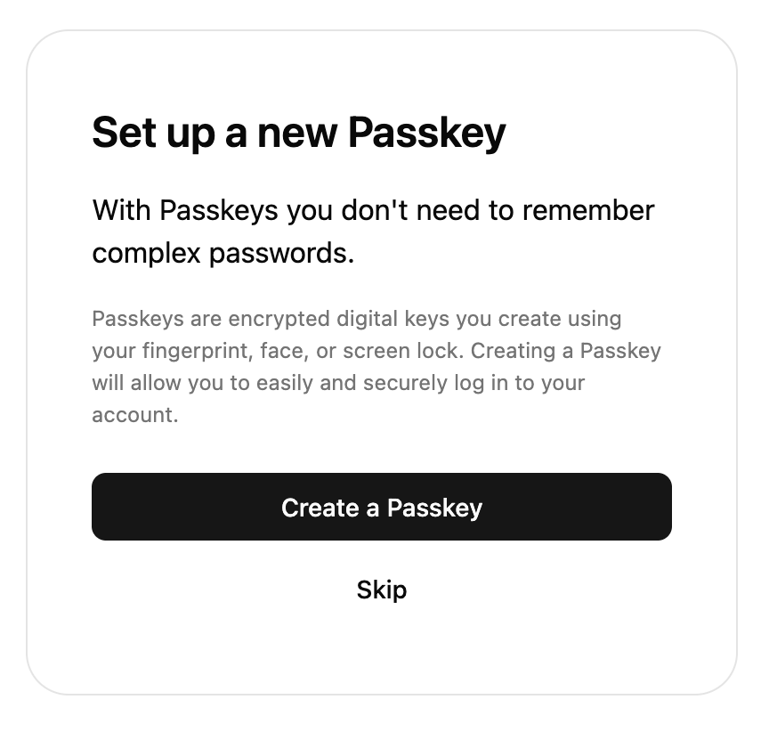 The SDK comes with a pre-built UI component to register passkeys. This component will only work when the user has an existing Stytch session.
## Props
The configuration object for the UI component. This component accepts the same `config` as StytchLogin so you can reuse the config, although most options will not have any effect.
The options for passkeys.
Sets the domain option for both WebAuthn registration and authentication. Defaults to the current page's hostname.
The `presentation` field allows you to customize the look of the SDK. This component accepts the same `presentation` prop as `StytchLogin` so you can reuse it. For more information, see the [Theming documentation](./theming).
Optional callbacks that are triggered by various events in the SDK. See more details about the callbacks [here](/api-reference/consumer/frontend-sdks/react/prebuilt-ui/login/callbacks).
A callback function that responds to events sent from the SDK.
Fired when the user successfully registers a new passkey.
```js data theme={null}
{
user_id: "user_id",
session: { ... },
user: { ... },
webauthn_registration_id: "webauthn-registration-test-db72fcc0-edae-4bb4-8d52-0b2a765683df"
}
```
Fired when the user presses the skip button.
Fired when the user presses the done button.
A callback function that responds to errors in the SDK. It is useful for debugging during development and error handling in production.
Specify custom strings to be used in the prebuilt UI. Consult the message catalog (messages/en.po) for the list of available strings. Each value should be specified using ICU MessageFormat.
Strings that are not defined will use the default English value as a fallback.
See [Text Customization](/api-reference/consumer/frontend-sdks/react/prebuilt-ui/text-customization) for more information.
```jsx theme={null}
import { Products, StytchPasskeyRegistration } from '@stytch/react';
const config = {
passkeysOptions: {
domain: 'example.com',
},
};
export const PasskeyRegistration = () => {
return ;
};
```
The SDK comes with a pre-built UI component to register passkeys. This component will only work when the user has an existing Stytch session.
## Props
The configuration object for the UI component. This component accepts the same `config` as StytchLogin so you can reuse the config, although most options will not have any effect.
The options for passkeys.
Sets the domain option for both WebAuthn registration and authentication. Defaults to the current page's hostname.
The `presentation` field allows you to customize the look of the SDK. This component accepts the same `presentation` prop as `StytchLogin` so you can reuse it. For more information, see the [Theming documentation](./theming).
Optional callbacks that are triggered by various events in the SDK. See more details about the callbacks [here](/api-reference/consumer/frontend-sdks/react/prebuilt-ui/login/callbacks).
A callback function that responds to events sent from the SDK.
Fired when the user successfully registers a new passkey.
```js data theme={null}
{
user_id: "user_id",
session: { ... },
user: { ... },
webauthn_registration_id: "webauthn-registration-test-db72fcc0-edae-4bb4-8d52-0b2a765683df"
}
```
Fired when the user presses the skip button.
Fired when the user presses the done button.
A callback function that responds to errors in the SDK. It is useful for debugging during development and error handling in production.
Specify custom strings to be used in the prebuilt UI. Consult the message catalog (messages/en.po) for the list of available strings. Each value should be specified using ICU MessageFormat.
Strings that are not defined will use the default English value as a fallback.
See [Text Customization](/api-reference/consumer/frontend-sdks/react/prebuilt-ui/text-customization) for more information.
```jsx theme={null}
import { Products, StytchPasskeyRegistration } from '@stytch/react';
const config = {
passkeysOptions: {
domain: 'example.com',
},
};
export const PasskeyRegistration = () => {
return ;
};
```