` to act as the shadow root for the component.
## Compatibility
Our themes use the [`color-mix` CSS function](https://caniuse.com/wf-color-mix) and the oklch color space to generate variant colors. If you need to support older browsers that do not support either of these, use `addColorFallback()` imported from `/compat` to generate the colors in JavaScript instead.
{`
const myTheme = { primary: '#ef223a' };
const theme = addColorFallback(myTheme);
// We recommend saving the output from addColorFallback and adding it to
// your theme to avoid including the function in your production bundle
console.log(theme);
const config = {
presentation: { theme },
};`}
## TypeScript
Types are available for all parts of `presentation`.
{`
const theme: Partial = { primary: '#ef223a' };
const options: PresentationOptions = { ... };
const icons: IconRegistry = { ... };
const presentation: PresentationConfig = {
theme,
options,
icons,
};`}
## Reference
### `presentation.theme`
The color scheme for the theme.
Duration for transitions.
#### Fonts
Base font for all text.
Font for monospace code, such as TOTP setup and recovery code.
Header font override. Defaults to base font-family.
#### Sizes
Base sizing variable. Changing this makes most spacing between elements larger or smaller.
Max width for outer container.
UI components are larger to accommodate touch screens below this size.
Base border radius.
Base font size.
Override for button border radius. Defaults to 2× rounded-base or 8px.
Override for input border radius. Defaults to 2× rounded-base or 8px.
Override for outer container border radius. Defaults to 6× rounded-base or 24px.
#### Shadows
Base box shadow, used for both buttons and inputs. Defaults to none.
Box shadow override for buttons.
Box shadow override for inputs.
#### Colors
Background color of the SDK container.
Default font color for text in the SDK container.
Your primary brand color. This will be applied to primary action buttons such as form submit buttons.
Text color contrasting with primary.
Your secondary brand color.
Text color contrasting with secondary.
A neutral, subtle color for areas such as the unfilled part of a progress bar.
Text color contrasting with muted, and also the color used for helper and other secondary text.
Your accent brand color. This will be applied to backgrounds to draw the user's attention, such as the backup code for TOTP registration.
Text color contrasting with accent.
Border color for the outer container and dividers.
Border color for inputs.
Input and button focus ring color.
Background and font color for destructive actions and error states. Defaults to red.
Text color contrasting with destructive.
Background and font color for warning states. Defaults to dark yellow.
Background and font color for successful states. Defaults to green.
Border color only for the outer container. Defaults to the value of border.
### `presentation.options`
The `presentation.options` object customizes non-style-related aspects of the SDK's appearance.
You can specify some of them or none at all. We'll use our defaults for the ones you don't specify.
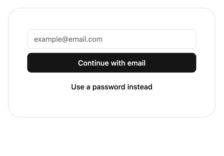
When this value is true, the title and description text will not show in the SDK.
The configuration object for your custom logo.
The URL of your custom logo.
The alt text for the logo for non-visual users. This is required for accessibility.
When true, the UI components will mount itself in a [shadow DOM](https://developer.mozilla.org/en-US/docs/Web/API/Web_components/Using_shadow_DOM). In `@stytch/vanilla-js`, use the `shadow` attribute on the custom elements or the `{ shadow: true }` option on the component constructor instead of this option. This defaults to false.
### `presentation.icons`
See [icon customization](#icon-customization).
 [From tweakcn](https://tweakcn.com/editor/theme?theme=neo-brutalism)
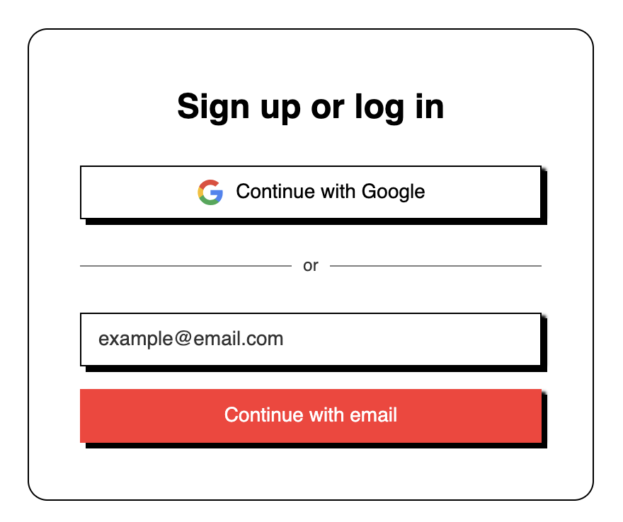
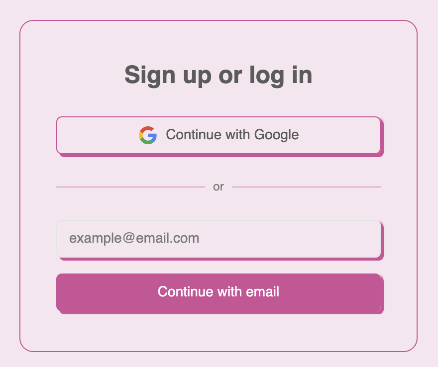 [From tweakcn](https://tweakcn.com/editor/theme?theme=bubblegum)
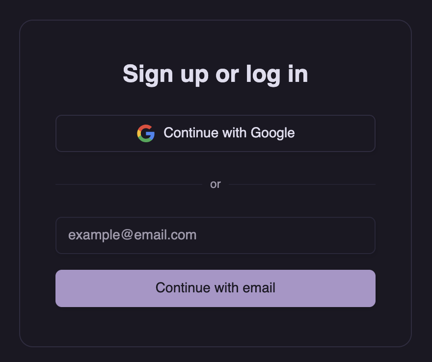 [From tweakcn](https://tweakcn.com/editor/theme?theme=amethyst-haze)
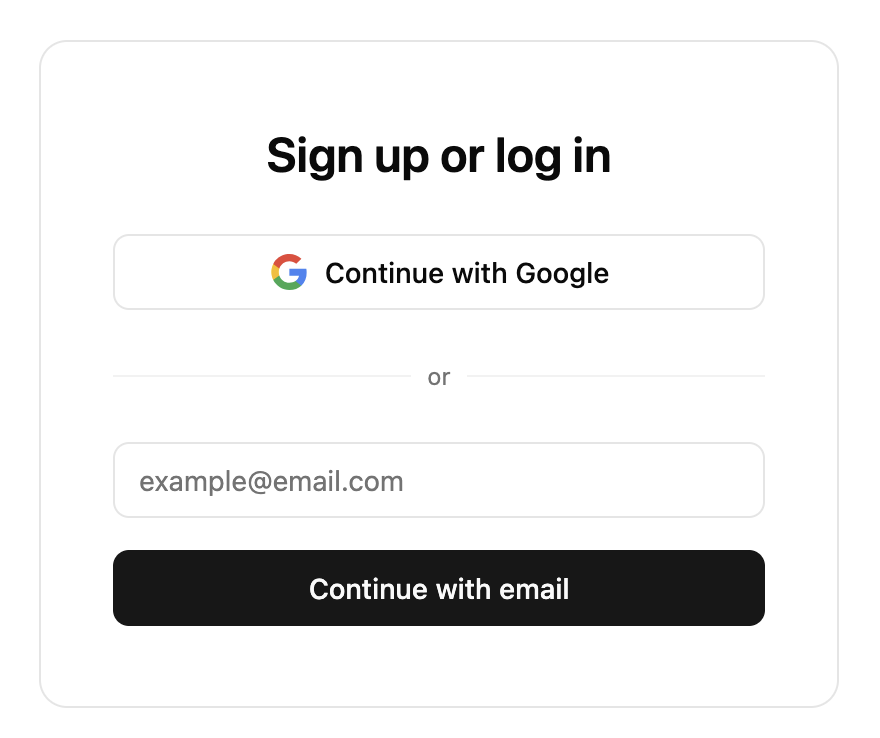
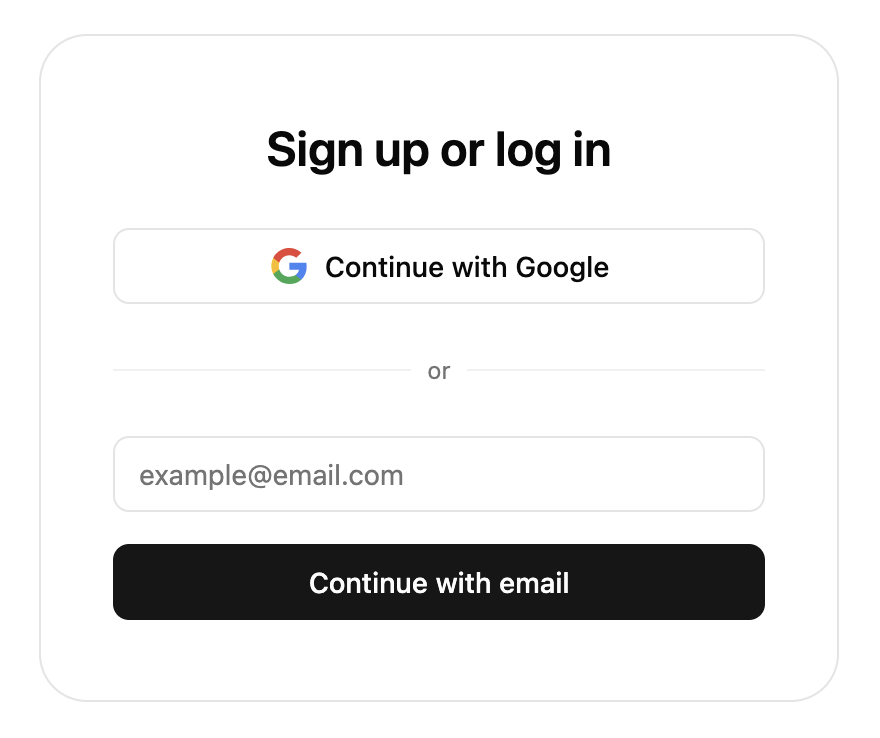 The light theme is the default and can be imported as `defaultTheme`.
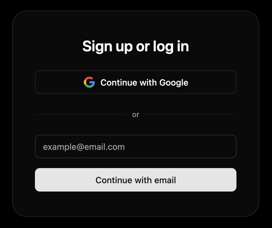 The default dark theme can be imported as `defaultDarkTheme`.
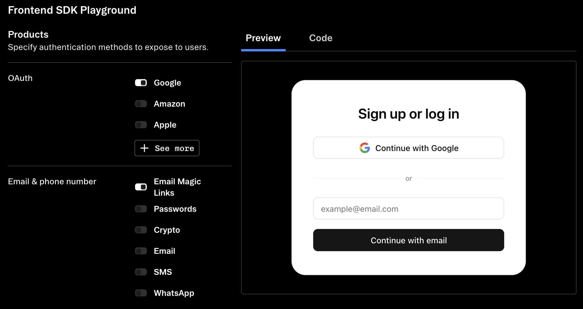 ](https://stytch.com/dashboard/sdk-playground)
## Additional options
### Logo and header customization
](https://stytch.com/dashboard/sdk-playground)
## Additional options
### Logo and header customization
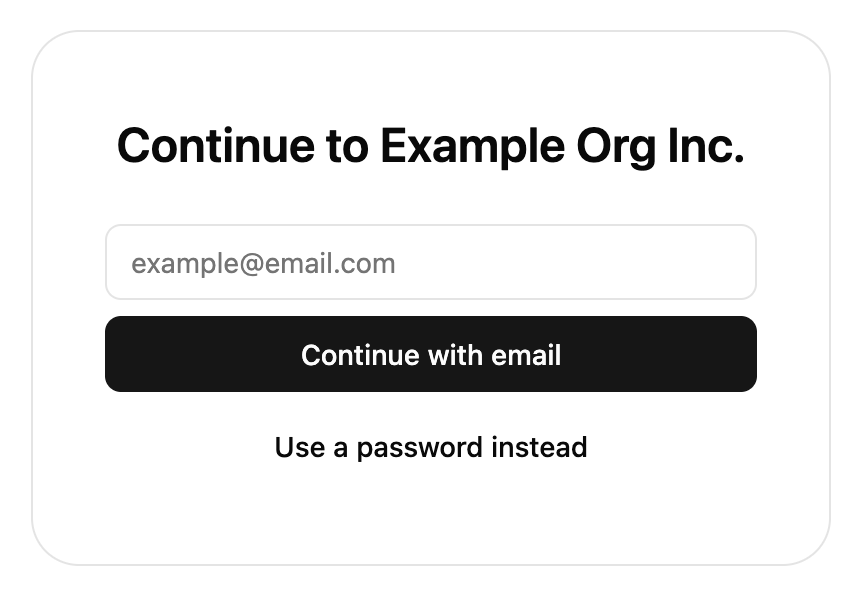
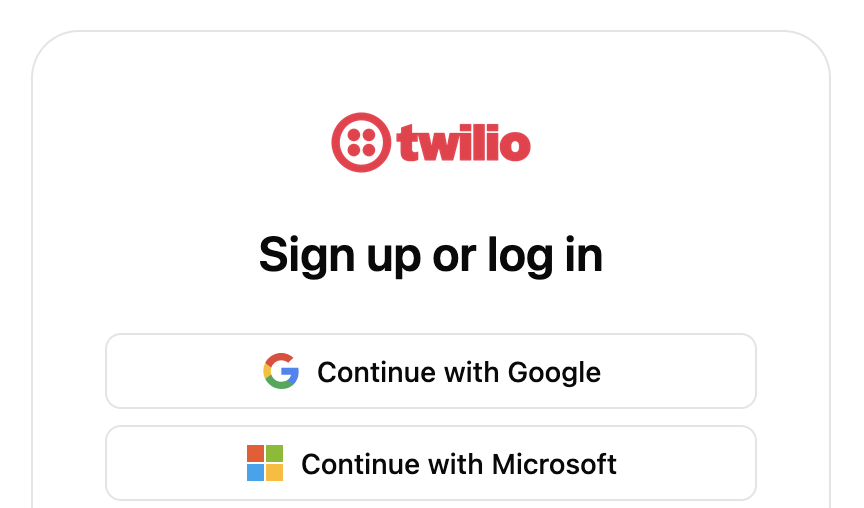 Use `options.logo` to configure the logo displayed at the top of the components. The logo will be resized to a maximum of 100×50px, but we recommend using an image at least 200×100px to support users with hi-dpi displays.
```js theme={null}
const presentation = {
options: {
url: 'https://example.com/logo.png',
alt: 'Your company name',
},
};
```
Use `options.hideHeaderText` to hide the heading and instruction text on some screens. This can be useful to avoid duplicating existing headings on the page and can be combined with setting `theme['container-border']` to 0 to blend the components into the page.
```js theme={null}
const presentation = {
options: {
hideHeaderText: true,
},
};
```
Use `options.logo` to configure the logo displayed at the top of the components. The logo will be resized to a maximum of 100×50px, but we recommend using an image at least 200×100px to support users with hi-dpi displays.
```js theme={null}
const presentation = {
options: {
url: 'https://example.com/logo.png',
alt: 'Your company name',
},
};
```
Use `options.hideHeaderText` to hide the heading and instruction text on some screens. This can be useful to avoid duplicating existing headings on the page and can be combined with setting `theme['container-border']` to 0 to blend the components into the page.
```js theme={null}
const presentation = {
options: {
hideHeaderText: true,
},
};
```