Back to blog
Making auth your growth lever
Auth & identity
Aug 31, 2022
Author: Reed McGinley-Stempel
If you’re spending time figuring out why it’s costing you more to acquire new users, or why user retention rates aren’t where you’d like them to be, consider tackling your sign-up and login flows. It’s more than just a way to securely let in a user - the sign-up and login experiences can, in fact, be delightfully seamless for users, serving to both let your product stand out and increase your overall conversion and retention rates.
It’s not a surprise to most that customer acquisition cost (CAC) has been going up across the board for some time now, whether it’s due to increasingly ad-weary users or major changes like Apple’s introduction of App Tracking Transparency on iOS. This makes it all the more important that you convert as many visitors as possible to keep CAC low - after all, you’ve already spent significant resources on growing your top-of-funnel through things like content, organic search, and paid ads, the worst that could happen is for it to all be in vain when a user drops off upon encountering a cumbersome sign-up flow. Below, we discuss ways to make your customer authentication experiences a core growth lever to increase immediate top-line revenue and improve the lifetime value (LTV) of your users.
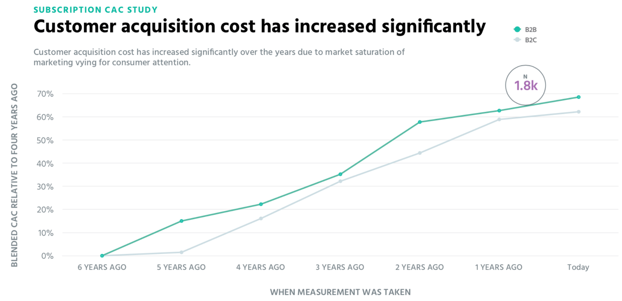
Even prior to Apple’s new App Tracking changes, CAC had risen sharply (~70%) in the previous 6 years. Most forecast another sharp increase with Apple’s new policy. (Source)
Boosting conversion
Authentication isn’t just something that your security team should care about. If you own your product’s growth metrics, auth is critically relevant to you as well. The user experience that you deliver to customers at sign-up and login directly impacts key business metrics, including top-line revenue, # of net new customers, CAC, and user retention figures like LTV.
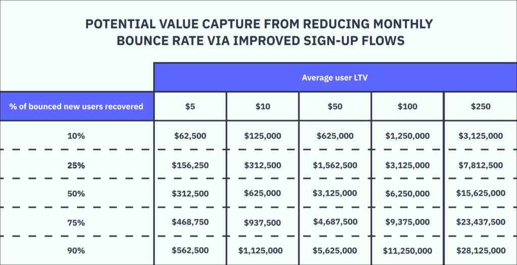
To help illustrate this more concretely, consider the fact that typical website bounce rates average around 41 to 55%, meaning these potential new users and customers are abandoning your site without ever interacting, let alone signing up. Anything you can do at the margins to recover bounced users can be meaningful.
Let’s assume your website has 1M monthly visitors, 30% of whom are eligible new users, and you have a bounce rate of 50%. You can quickly see that recovering even just a small portion of bounced users can add up to material monetary impact.
Many innovative companies are already waking up to this and have endeavored to reduce friction as much as possible. Consider Slack, Cash App, or Monzo, who have all adopted passwordless flows through auth methods like email magic links and SMS passcodes. Or consider Pinterest, Zapier, and Doordash, who have all adopted Google One Tap to enable what is effectively one-click signup.
These companies have homed in on a few key principles around boosting signup conversion by using auth as a lever:
1. Optimizing the homepage. A common theme across these apps is a singular focus on nudging new visitors toward account creation. Consider how Monzo aims to make their call-to-action clear (front and center) and frictionless (on mobile, the CTA is deeplinked to the App Store, whereas on desktop a QR code allows the user to jump devices with minimal effort).
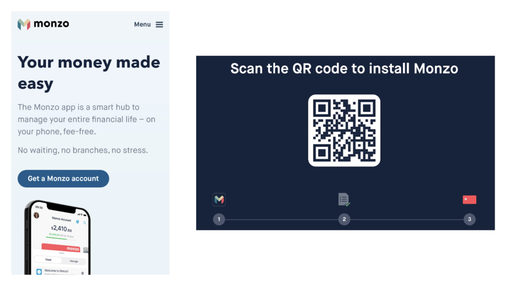
Monzo login with QR codes
And consider how Cash App removes all distractions and allows the user to focus on a single field and call-to-action (no password required).
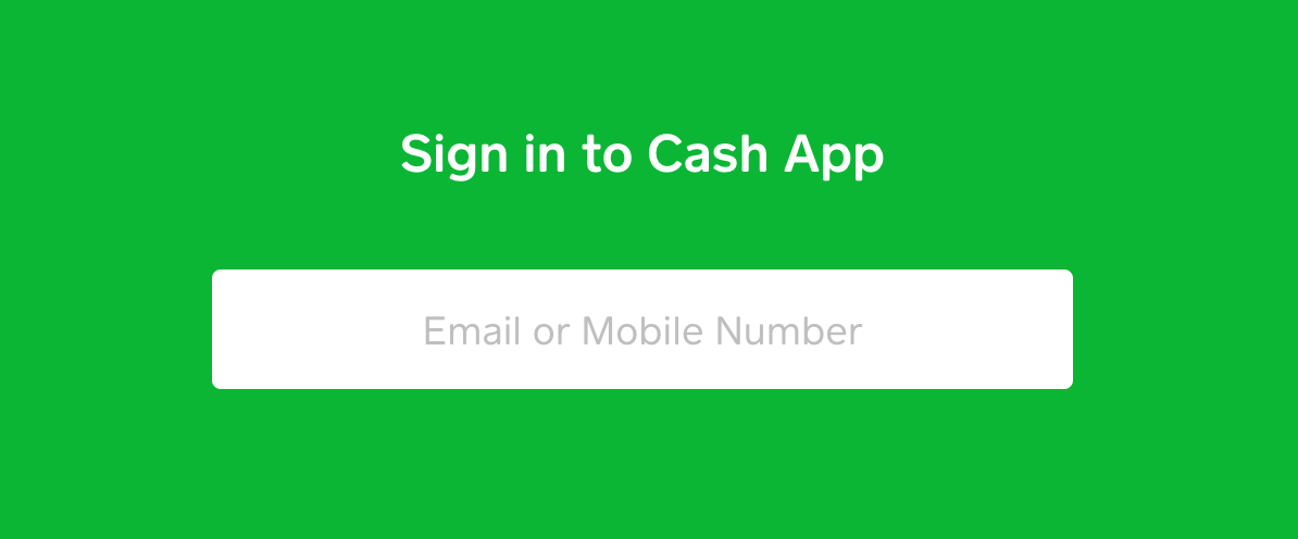
CashApp login screen – no distractions, no notes!
2. Organically nudging visitors to sign up. These apps have also realized that there’s no better way to demonstrate your value prop than to get your user in the product ASAP, so they continue to nudge new visitors toward signup throughout their site. For example, Pinterest and Doordash leverage Google One Tap to ensure visitors are always one click away from signup wherever they are.
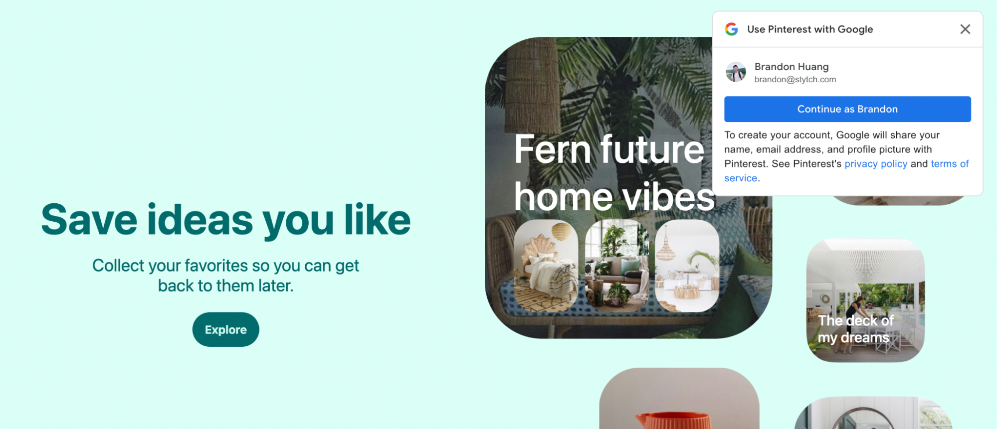
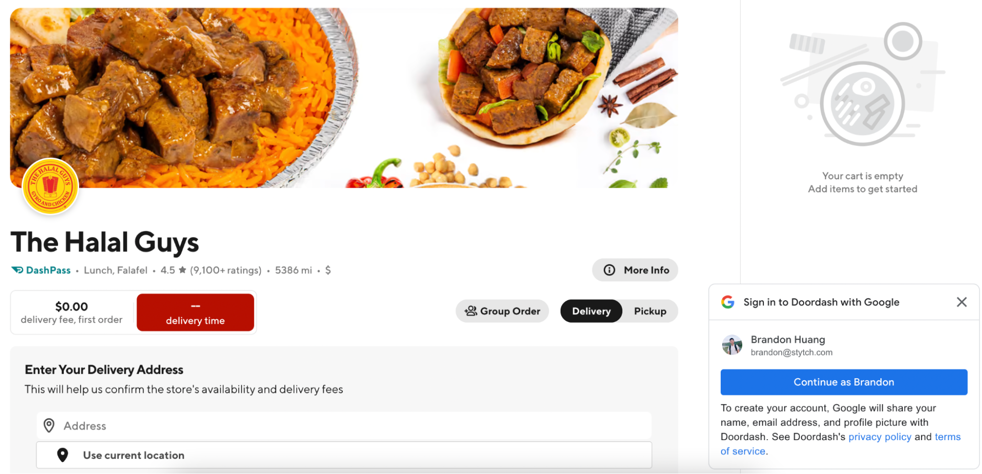
Note the sticky login modal for both Pinterest and DoorDash
Boosting retention
As much as customer identity and access management (CIAM) is about getting users in the door, it’s also critical to keep users returning and engaged to fully realize their potential LTV. Many of us are likely familiar with the experience of pulling up an app we’d downloaded weeks ago, only to have to go through an arduous password reset process just to get back into our account - many users give up halfway through this byzantine process and abandon the app completely.
With thoughtful tooling around how you build auth, you can make it as easy as possible for your users to return and re-engage with your product.
Want to make auth your growth lever? Switch to Stytch today.
Pricing that scales with you • No feature gating • All of the auth solutions you need plus fraud & risk
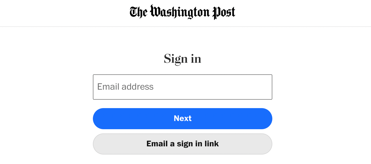
1. Take advantage of password resets. Users don’t actually want to reset their password - they just want to get back in. This is a perfect opportunity to offer a passwordless option and ensure they never encounter a forgotten password again. For example, The Washington Post provides an “Email a sign in link” option:
Alternatively, you could provide a passwordless option in the password reset flow itself:
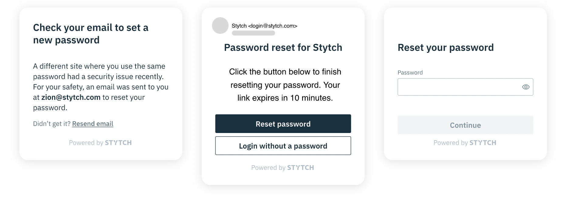
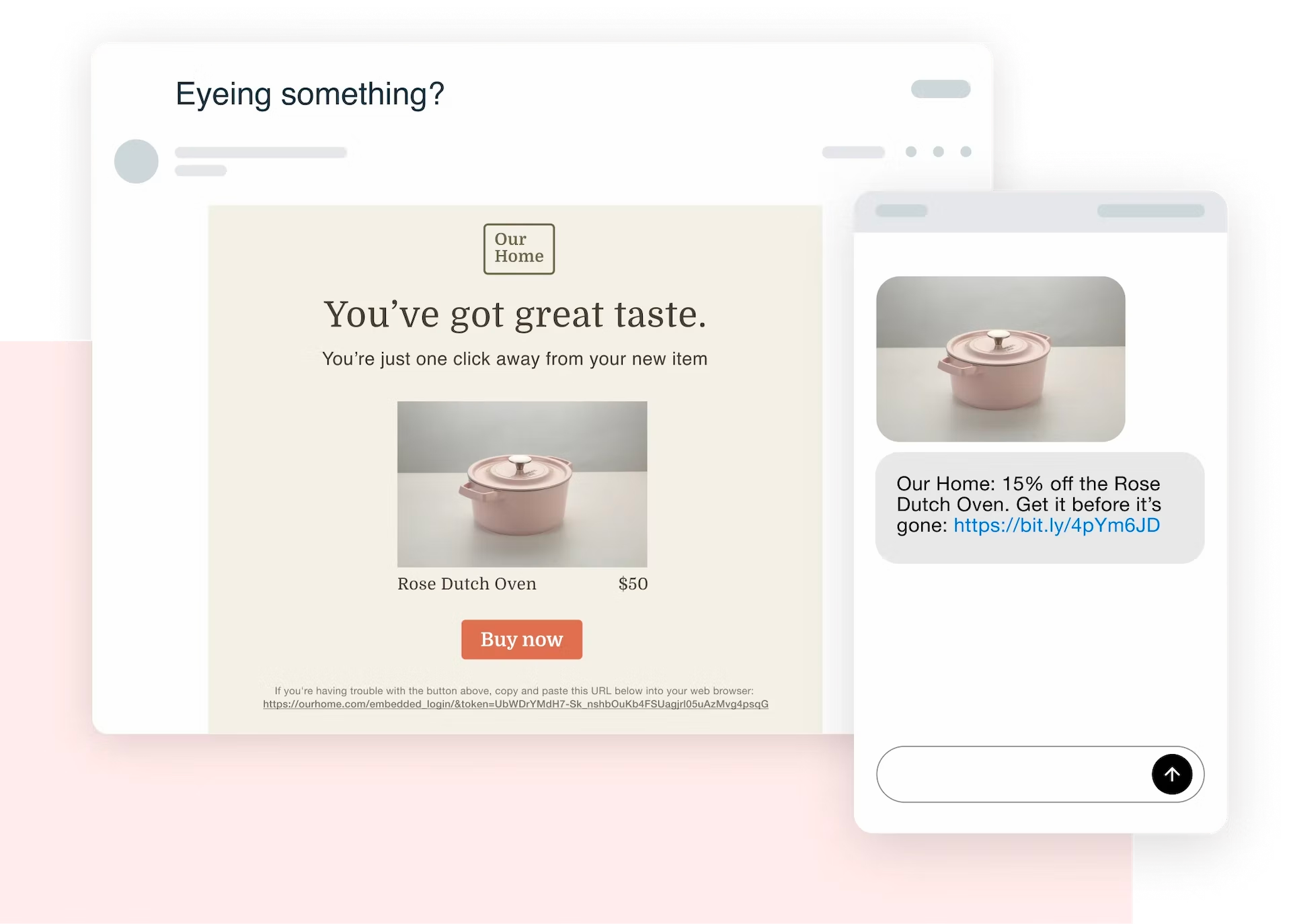
2. Embed auth into CTAs. Imagine receiving an email from your favorite brand about an on-sale item you’ve had your eye on - you click through, ready to buy, but are prompted with a login screen instead. Companies frequently leave money on the table by throwing up these types of barriers, which you could easily avoid by embedding auth into the hyperlink itself. The user has already proven access to their email or phone, so you can quickly drop them into a logged-in state without disrupting the flow.
3. Use step up authentication to layer on extra security only when it’s needed. Lastly, it’s important to remember that not all authentication is created equal. Many apps (banking in particular) require multi-factor authentication each and every time a user opens their app, but often this is a heavy-handed experience built in the name of security at the expense of user experience. Instead, consider only stepping up users to a second factor when their action warrants it (e.g., making a financial transaction, updating personal information, etc.). This type of “just-in-time” auth ensures you only introduce friction as needed, rather than subjecting your entire user base to unnecessary re-engagement barriers.
How will you boost growth?
Customer identity and access management is often overlooked as something that can be optimized for growth, but some of the most innovative companies out there are already leading the way by ensuring their authentication experiences are finely tuned for maximum conversion and retention.
Here at Stytch, we have a front-row seat to how companies are modernizing their auth flows, and we’d love to chat with you about how you can as well. Feel free to reach out to us to book a quick UX consultation - we’re excited to review your UX and offer our tips and best practices around where you can optimize for continued growth.
Authentication & Authorization
Fraud & Risk Prevention
© 2025 Stytch. All rights reserved.
