> ## Documentation Index
> Fetch the complete documentation index at: https://stytch.com/docs/llms.txt
> Use this file to discover all available pages before exploring further.

# Upgrade Guide

> How to upgrade between major versions of the SDK

export const Products = ({type, packageName}) => {
  const importName = type === "b2b" ? "B2BProducts" : "Products";
  const importPath = "@stytch/" + packageName + (type === "b2b" ? "/b2b" : "");
  return <>
      <p>If <code>config.products</code> are specified as strings, update them to use <code>{importName}</code> instead:</p>

      <CodeBlock language="js">{`
import { ${importName} } from '${importPath}'; // [!code ++]

const config = {
  products: ['oauth', 'eml'], // [!code --]
  products: [${importName}.oauth, ${importName}.emailMagicLinks], // [!code ++]
};`}
      </CodeBlock>
    </>;
};

export const Strings = ({type, packageName}) => {
  const stringCustomizationLink = type === "b2b" ? `/api-reference/b2b/frontend-sdks/${packageName}/prebuilt-ui/login/text-customization` : `/api-reference/consumer/frontend-sdks/${packageName}/prebuilt-ui/text-customization`;
  return <>
      <p>
        If you use <a href={stringCustomizationLink}>string customization</a>,
        check if you need to update these strings:
      </p>

      <Expandable title="updated strings">
        <table>
          <thead>
            <tr>
              <th>Old ID</th>
              <th>Old Text</th>
              <th>New ID</th>
              <th>New Text</th>
              <th>Notes</th>
            </tr>
          </thead>
          <tbody>
            <tr>
              <td>button.back.ariaLabel</td>
              <td>Back</td>
              <td>button.goBack</td>
              <td>Go back</td>
              <td>
                <a href="#footnote-1">
                  <strong>1</strong>
                </a>
              </td>
            </tr>
            <tr>
              <td>button.forgotPassword</td>
              <td>Forgot Password?</td>
              <td>(Unchanged)</td>
              <td>Forgot your password?</td>
              <td></td>
            </tr>
            <tr>
              <td>password.forgot.title</td>
              <td>Forgot password?</td>
              <td>(Unchanged)</td>
              <td>Forgot your password?</td>
              <td></td>
            </tr>
            <tr>
              <td>button.hidePassword</td>
              <td>Hide password</td>
              <td>(Unchanged)</td>
              <td>Hide</td>
              <td>
                <a href="#footnote-1">
                  <strong>1</strong>
                </a>
              </td>
            </tr>
            <tr>
              <td>button.showPassword</td>
              <td>Show password</td>
              <td>(Unchanged)</td>
              <td>Show</td>
              <td>
                <a href="#footnote-1">
                  <strong>1</strong>
                </a>
              </td>
            </tr>
            <tr>
              <td>button.loginWithoutPassword</td>
              <td>Login without a password</td>
              <td>(Unchanged)</td>
              <td>Log in without a password</td>
              <td></td>
            </tr>
            <tr>
              <td>crypto.error.content</td>
              <td>
                Your sign in request could not be completed. Use the back arrow
                to return to the log in screen and try again!
              </td>
              <td>(Unchanged)</td>
              <td>
                Your sign in request could not be completed. Go back to the main
                screen and try logging in again.
              </td>
              <td></td>
            </tr>
            <tr>
              <td>crypto.setupNewWallet.content</td>
              <td>
                Signing in with a crypto wallet can help keep your account
                private and secure.
              </td>
              <td>(Unchanged)</td>
              <td>Get started by downloading any Ethereum or Solana wallet.</td>
              <td></td>
            </tr>
            <tr>
              <td>crypto.setupNewWallet.instruction</td>
              <td>
                Get started by downloading any Ethereum or Solana wallet. We've
                included a few examples of wallet extensions you can find below.
                Once you've set up your wallet, you can use it to sign in!
              </td>
              <td>(Unchanged)</td>
              <td>
                We've included a few examples of wallet extensions you can find
                below. Once you've set up your wallet, click "Go back" to use it
                and sign in.
              </td>
              <td></td>
            </tr>
            <tr>
              <td>crypto.troubleHelp</td>
              <td>
                Having trouble? Use the back arrow to return to the main screen
                and try logging in again.
              </td>
              <td>(Unchanged)</td>
              <td>
                If you are having trouble, go back to the main screen and try
                logging in again.
              </td>
              <td></td>
            </tr>
            <tr>
              <td>oauth.continueWithTwitter</td>
              <td>Continue with Twitter</td>
              <td>oauth.continueWithX</td>
              <td>Continue with X</td>
              <td></td>
            </tr>
            <tr>
              <td>passcode.codeSent / passcode.didntGetIt</td>
              <td>Code sent / Didn't get it?</td>
              <td>passcode.codeSent</td>
              <td>Code sent! Try again in {"{timeRemaining}s"}</td>
              <td></td>
            </tr>
            <tr>
              <td>toast.emailResent</td>
              <td>Email resent</td>
              <td>button.emailResent</td>
              <td>Email resent! Try again in {"{timeRemaining}s"}</td>
              <td></td>
            </tr>
            <tr>
              <td>password.didntGetItResend</td>
              <td>
                Didn't get it? &lt;resendButton&gt;Resend
                email&lt;/resendButton&gt;
              </td>
              <td>button.resendEmail</td>
              <td>Resend email</td>
              <td></td>
            </tr>
            <tr>
              <td>watermark.altText</td>
              <td>Powered by Stytch</td>
              <td>(Unchanged)</td>
              <td>Stytch by Twilio</td>
              <td></td>
            </tr>
          </tbody>
        </table>

        <p id="footnote-1">
          <sup>1</sup> This was previously only for non-visual users, now it is
          displayed as text.
        </p>
      </Expandable>

      <p>You may also wish to customize these new strings:</p>

      <Expandable title="new strings">
        <table>
          <thead>
            <tr>
              <th>ID</th>
              <th>Text</th>
              <th>Notes</th>
            </tr>
          </thead>
          <tbody>
            <tr>
              <td>loading.label</td>
              <td>Loading</td>
              <td></td>
            </tr>
            <tr>
              <td>emailConfirmation.emailSent</td>
              <td>Email sent! Try again in {`{timeRemaining}`}s</td>
            </tr>
            <tr>
              <td>password.requirement.fulfilled</td>
              <td>Fulfilled</td>
              <td>
                <a href="#footnote-2">
                  <strong>2</strong>
                </a>
              </td>
            </tr>
            <tr>
              <td>password.requirement.notFulfilled</td>
              <td>Not fulfilled</td>
              <td>
                <a href="#footnote-2">
                  <strong>2</strong>
                </a>
              </td>
            </tr>
            <tr>
              <td>password.requirement.suggestion</td>
              <td>Suggestion</td>
              <td>
                <a href="#footnote-2">
                  <strong>2</strong>
                </a>
              </td>
            </tr>
            <tr>
              <td>password.requirement.warning</td>
              <td>Warning</td>
              <td>
                <a href="#footnote-2">
                  <strong>2</strong>
                </a>
              </td>
            </tr>
            <tr>
              <td>tab.listLabel</td>
              <td>Select login method</td>
              <td>
                <a href="#footnote-2">
                  <strong>2</strong>
                </a>
              </td>
            </tr>
            <tr>
              <td>watermark.poweredBy</td>
              <td>Powered by</td>
              <td></td>
            </tr>
          </tbody>
        </table>

        <p id="footnote-2">
          <sup>2</sup> This is an accessibility label for non-visual users.
        </p>
      </Expandable>
    </>;
};

export const Theme = ({type, packageName}) => {
  const compatPath = "@stytch/" + packageName + "/compat";
  return <>
<p>The new <code>presentation</code> property now controls theming and styling options.
This differs from the previous <code>style</code> property in that it configures tokens affecting many elements rather than properties on specific elements.</p>

<p>We have provided a migration helper function. In development mode this function
will also print out warnings about properties that could not be migrated.</p>

<CodeBlock language="js">{`
import { styleToTheme } from '${compatPath}'; // [!code ++]

const config = {
  style: { ... }, // [!code --]
  // This will also print out the recommended migrated config // [!code ++:3]
  // which should replace this in production
  theme: styleToTheme({ ... }),
};
`}</CodeBlock>

For a full list of supported properties, see reference documentation for <a href="./prebuilt-ui/theming#reference"><code>presentation</code></a>.

<h3><code>presentation.theme</code></h3>

<p>Controls CSS styling. 
  Each token corresponds to some CSS properties, so each value should be a CSS value.
  You can also provide an array of <code>[lightTheme, darkTheme]</code> which will automatically switch 
  between the two depending on the user's OS color scheme.
</p>

<Expandable title="theme migration">
  <table>
    <thead>
      <tr>
        <th>style</th>
        <th>presentation.theme</th>
      </tr>
    </thead>
    <tbody>
      <tr>
        <td>container.backgroundColor</td>
        <td>background</td>
      </tr>
      <tr>
        <td>container.borderColor</td>
        <td>border / container-border</td>
      </tr>
      <tr>
        <td>container.borderRadius</td>
        <td>rounded-base / container-radius</td>
      </tr>
      <tr>
        <td>container.width</td>
        <td>container-width</td>
      </tr>
      <tr>
        <td>colors.primary</td>
        <td>primary</td>
      </tr>
      <tr>
        <td>colors.secondary</td>
        <td>secondary</td>
      </tr>
      <tr>
        <td>colors.accent</td>
        <td>accent</td>
      </tr>
      <tr>
        <td>colors.success</td>
        <td>success</td>
      </tr>
      <tr>
        <td>colors.warning</td>
        <td>warning</td>
      </tr>
      <tr>
        <td>colors.error</td>
        <td>destructive</td>
      </tr>
      <tr>
        <td>buttons.primary.backgroundColor</td>
        <td>primary</td>
      </tr>
      <tr>
        <td>buttons.primary.textColor</td>
        <td>primary-foreground</td>
      </tr>
      <tr>
        <td>buttons.primary.borderRadius</td>
        <td>rounded-base / button-radius</td>
      </tr>
      <tr>
        <td>buttons.secondary.backgroundColor</td>
        <td>secondary</td>
      </tr>
      <tr>
        <td>buttons.secondary.textColor</td>
        <td>secondary-foreground</td>
      </tr>
      <tr>
        <td>buttons.secondary.borderRadius</td>
        <td>rounded-base / button-radius</td>
      </tr>
      <tr>
        <td>inputs.borderColor</td>
        <td>input</td>
      </tr>
      <tr>
        <td>inputs.placeholderColor</td>
        <td>muted-foreground</td>
      </tr>
      <tr>
        <td>inputs.borderRadius</td>
        <td>rounded-base / input-radius</td>
      </tr>
      <tr>
        <td>fontFamily</td>
        <td>font-family</td>
      </tr>
    </tbody>
  </table>

  <p>New properties:</p>

  <ul>
    <li><strong>color-scheme</strong>: Declares the theme as either light or dark.</li>
    <li><strong>font-family-mono</strong>: Font for TOTP and recovery code</li>
    <li><strong>header-font</strong>: Font for headers</li>
    <li><strong>spacing</strong>, <strong>rounded-base</strong>, <strong>text-base</strong>: Base units for size and spacing between items, border radius and font size</li>
    <li><strong>mobile-breakpoint</strong>: Screen width at which input and buttons are rendered larger for touchscreen users</li>
    <li><strong>shadow</strong>, <strong>shadow-button</strong>, <strong>shadow-input</strong>: Optional box-shadow applied to buttons and inputs</li>
    <li><strong>transition-duration</strong>: Transition duration. Set to 0 to disable transitions</li>
  </ul>
</Expandable>

<h3><code>presentation.options</code></h3>

Controls non-styling options such as the logo to display.

<Expandable title="options migration">
  <table>
    <thead>
      <tr>
        <th>style</th>
        <th>presentation.options</th>
      </tr>
    </thead>
    <tbody>
      <tr>
        <td>hideHeaderText</td>
        <td>hideHeaderText</td>
      </tr>
      <tr>
        <td>logo.logoImageUrl</td>
        <td>logo.url</td>
      </tr>
    </tbody>
  </table>

  <p>New properties:</p>

  <ul>
    <li><strong>logo.alt</strong>: Alt text for the logo</li>
  </ul>
</Expandable>

<h3>More styling changes</h3>

<p>These changes are unlikely to cause issues.</p>

<Expandable title="more style changes">
<h3>Component size</h3>
<p>Stytch UI component now use <code>max-width</code> rather than <code>width</code> to make it more flexible. This means the component may render at a size smaller than expected if it is placed in a flexbox or grid. To restore previous behavior, wrap it in a <code>div</code> with your desired width.</p>

<CodeBlock language="jsx">{packageName === 'vanilla-js' ? `
<div style="width: 400px">
  <stytch-ui />
</div>`.trim() : type === 'b2b' ? `
<div style={{ width: '400px' }}>
  <StytchB2B />
</div>`.trim() : `
<div style={{ width: '400px' }}>
  <StytchLogin />
</div>`.trim()}
</CodeBlock>

<h3>Style isolation and injection</h3>

<p>The SDK now injects styles into the <code>head</code> element as a <code>style</code> tag. The component styling is also slightly less aggressive, so global styles may affect internal styling differently. If you would like complete style isolation, we recommend enabling shadow DOM.</p>

<CodeBlock language="jsx">
{packageName === 'vanilla-js' ? '<stytch-ui shadow="true" />' : `
const presentation = {
  options: {
    enableShadowDOM: true,
  },
};`}
</CodeBlock>

<h3>Element IDs</h3>

<p>Some element IDs have been removed. To restore them, use `presentation.options.buttonId`. We do not recommend using the IDs to modify Stytch UI component styles or DOM.</p>

<CodeBlock language="js">{`
const presentation = {
  options: {
    buttonId: true, // Or set to a string to add a suffix to make ID unique
  },
};
`.trim()}</CodeBlock>
  </Expandable>
    </>;
};

export const Compatibility = () => {
  return <ul>
      <li>Browser support: We support Safari mobile and desktop 16, Chrome 109 and Firefox 106.
        Browsers older than this may still be able to use our SDK, but may require additional transpile and polyfills.</li>
      <li>No polyfills are included since all APIs used are also supported in the versions supported.</li>
      <li>Custom themes require support for <a href="https://caniuse.com/wf-color-mix"><code>color-mix</code> CSS function</a>.
        A compatibility helper is available if you are targeting older browsers.</li>
    </ul>;
};

# From 19 to 20

## Compatibility

<Compatibility />

## Step by step guide

<Steps>
  <Step title="Upgrade packages">
    Upgrade `@stytch/react` and remove `@stytch/vanilla-js`:
    vanilla-js is now included in `@stytch/react` and no longer a peer dependency.

    ```json package.json theme={null}
    "@stytch/react": "^19.0.0", // [!code --]
    "@stytch/vanilla-js": "^5.0.0", // [!code --]
    "@stytch/react": "^20.0.0", // [!code ++]
    ```

    Run `npm`, `yarn` or `pnpm` to install the new version.
  </Step>

  <Step title="Update imports">
    Copy all imports from `@stytch/vanilla-js` to `@stytch/react`.
    The `b2b/ui` and `b2b/headless` imports have also been merged into the main `b2b` import.

    ```js theme={null}
    import React from 'react';
    import { StytchB2B, StytchB2BProvider } from '@stytch/react/b2b'; // [!code --]
    import { createStytchB2BUIClient } from '@stytch/react/b2b/ui'; // [!code --]
    import { AuthFlowType, B2BOAuthProviders, B2BProducts } from '@stytch/vanilla-js/b2b'; // [!code --]
    import { // [!code ++:8]
      AuthFlowType,
      B2BOAuthProviders,
      B2BProducts,
      StytchB2B,
      StytchB2BProvider,
      createStytchB2BUIClient,
    } from '@stytch/react/b2b';
    ```
  </Step>

  <Step title="Update products configuration">
    <Products type="b2b" packageName="react" />
  </Step>

  <Step title="Update styles to presentation">
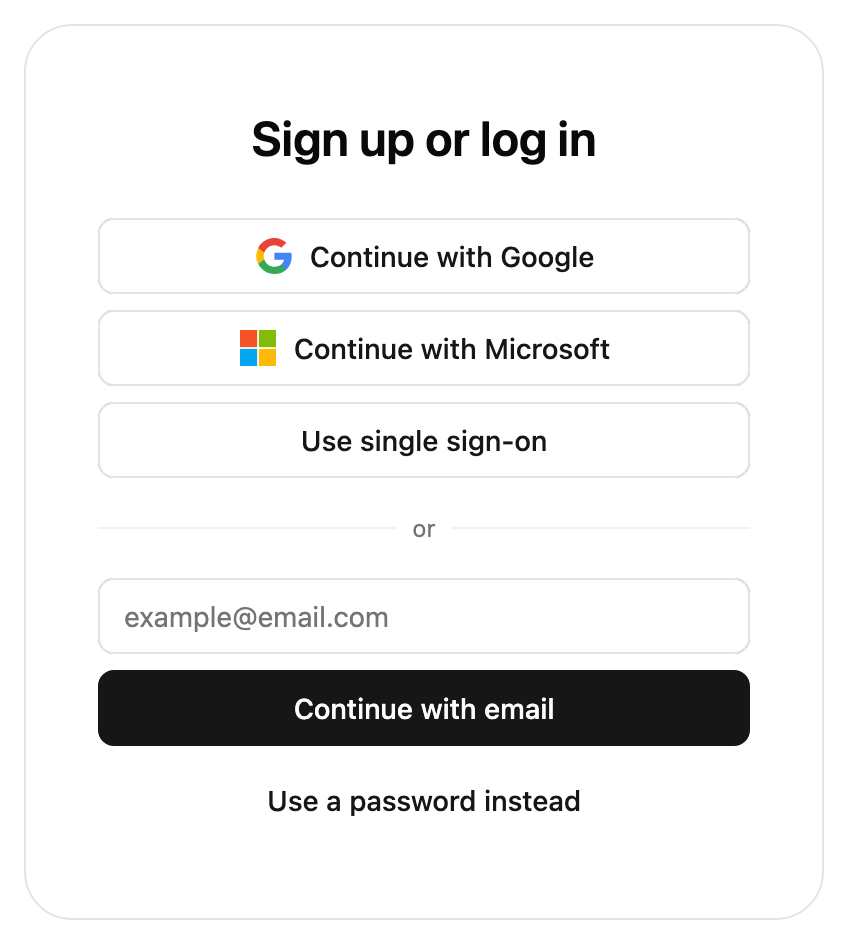
    <img src="https://mintcdn.com/stytch-34ca0595/93M76QAF-n7zps9g/images/api-reference/b2b/frontend-sdks/prebuilt-ui-login.png?fit=max&auto=format&n=93M76QAF-n7zps9g&q=85&s=fe694852aa671c0de17daf942b27b29c" alt="" style={{ maxWidth: "400px" }} width="850" height="944" data-path="images/api-reference/b2b/frontend-sdks/prebuilt-ui-login.png" />

    <Theme type="b2b" packageName="react" />
  </Step>

  <Step title="Update customized strings">
    <Strings type="b2b" packageName="react" />
  </Step>

  <Step title="Update deprecated imports">
    The following are deprecated and should be updated.

    * `createStytchB2BUIClient` → `createStytchB2BClient`
    * `createStytchB2BHeadlessClient` → `createStytchB2BClient`
    * `StytchB2BUIClient`  → `StytchB2BClient`
    * `StytchB2BHeadlessClient`  → `StytchB2BClient`
  </Step>

  <Step title="Test your changes">
    We recommend running through every auth method used to make sure the new theme looks correct in context. You should also take note of errors or warnings in the browser console.
  </Step>
</Steps>
