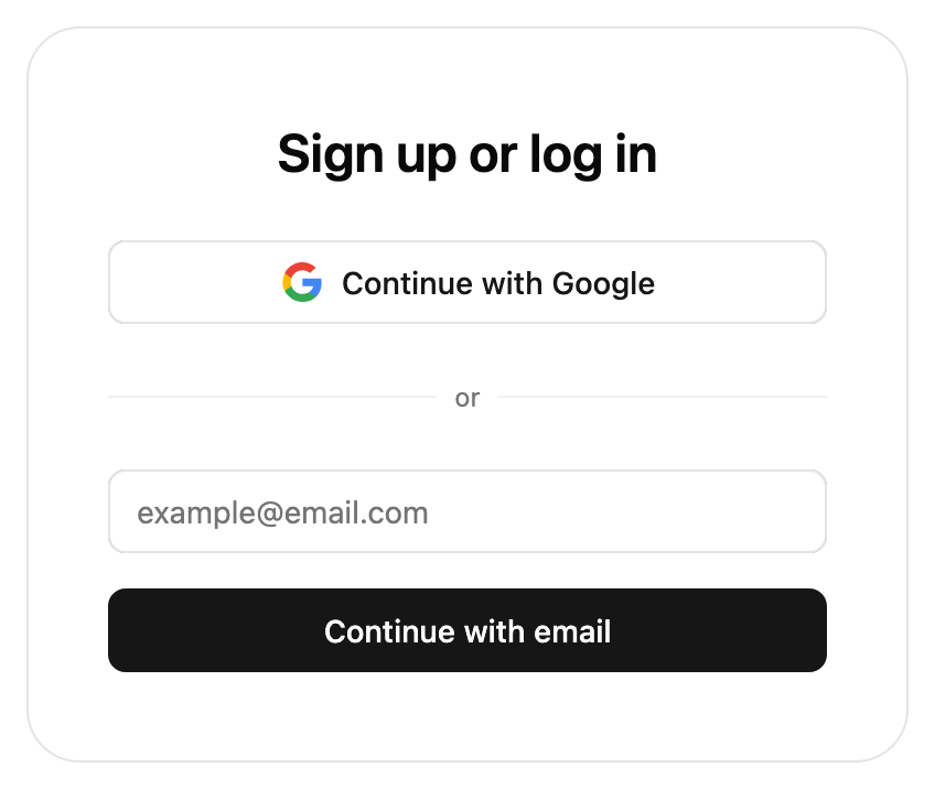
/
Contact usSee pricingStart building
    Overview
    Installation
    Changelog

    Pre-built UI

    StytchLogin
      UI Configuration
      UI Callbacks
      Text Customization
      Component Playground
    StytchPasswordReset
    StytchPasskeyRegistration
    IdentityProvider
      UI Configuration
      UI Callbacks

    Headless

    Users
      Get user
      Update user
      Delete authentication factors
    Email Magic Links
      Send
      Login or create
      Authenticate
    OAuth
      Start
      Google One Tap
      Authenticate
    Passwords
      Create
      Authenticate
      Reset by Email Start
      Reset by Email
      Reset by Existing Password
      Reset by Session
      Strength Check
    One-Time Passcodes (OTP)
      Login or create via SMS
      Send via SMS
      Login or create via Email
      Send via Email
      Login or create via WhatsApp
      Send via WhatsApp
      Authenticate
    Time-Based One-Time Passcodes (TOTP)
      Create
      Authenticate
      Get Recovery Codes
      Recover
    Session Management
      Get Session
      Authenticate Session
      Revoke Session
      Update Session
      Get Tokens
      Attest Session
      Exchange Access Token
    Passkeys & WebAuthn
      Register
      Authenticate
      Update
      Browser supports autofill
    Crypto Wallets
      Authenticate
      Authenticate Start
    Impersonation
      Authenticate
    RBAC
      Is Authorized
      Permissions
    Connected Apps
      Get Connected Apps
      Revoke Connected App
      Start OAuth Authorization
      Submit OAuth Authorization

    More Resources

    Cookies & session management
    SWR & caching
    TypeScript
    User privacy measures
    Multi-factor authentication
    Next.js
    CAPTCHA
Get support on SlackVisit our developer forum

Contact us

Consumer Authentication

/

Frontend SDKs

/

Pre-built UI

/

IdentityProvider

/

UI Configuration

IdentityProvider

IDP SSO Consent Screen UI

The IdentityProvider function renders UI to enable the logged-in user to perform an OAuth Authorization flow with a pre-registered Connected App. The UI component will automatically parse out OAuth related fields from the query params, such as client_id, redirect_uri, scope, and state.

The user must be logged in before this component is rendered.

For an overview of when consent is required, see our Consent Management guide.

If your project has Custom Scopes configured, the Consent UI can be customized via the getIDPConsentManifest prop. Supply a custom manifest for fine-grained control over the wording used and grouping of the permissions being requested. If no getIDPConsentManifest function is defined, the description field for each scope will be used instead.

IdentityProvider must be wrapped inside a StytchProvider. Take a look at our installation guide for more information on how to configure the StytchProvider for your framework.


Fields


styles object

The style object allows you to customize the look of the SDK. You can specify some of them or none at all. We'll use our defaults for the ones you don't specify.

fontFamily string

The font family that will apply to all text in the SDK.

hideHeaderText boolean

When this value is true, the title and description text will not show in the SDK.

container object

The configuration object for the Stytch UI container.

width string

The width of the SDK container.

backgroundColor string

The background color of the SDK container.

borderColor string

The border color of the SDK container.

borderRadius string

The border radius of the SDK container.

colors object

The configuration object for colors used in the Stytch UI components.

primary string

Your primary brand color. This will be applied to most of the text in the SDK.

secondary string

Your secondary brand color. This will be applied to text disclaimers and other visual elements.

success string

A success color to be used in visual elements.

error string

An error color to be used in visual elements.

buttons object

The configuration object for buttons in the Stytch UI component.

primary object

The configuration object for primary buttons

textColor string

The text color of the primary button.

backgroundColor string

The background color of the primary button.

borderColor string

The border color of the primary button.

borderRadius string

The border radius of the primary button.

secondary object

The configuration object for secondary buttons

textColor string

The text color of the secondary button.

backgroundColor string

The background color of the secondary button.

borderColor string

The border color of the secondary button.

borderRadius string

The border radius of the secondary button.

disabled object

The configuration object for disabled buttons

textColor string

The text color of the disabled button.

backgroundColor string

The background color of the disabled button.

borderColor string

The border color of the disabled button.

borderRadius string

The border radius of the disabled button.

inputs object

The configuration object for text inputs in the Stytch UI components.

textColor string

The text color of the text inputs.

backgroundColor string

The background color of the text inputs.

placeholderColor string

The color of the placeholder text in the text inputs.

borderColor string

The border color of the text inputs.

borderRadius string

The border radius of the text inputs.

logo object

The configuration object for your custom logo.

logoImageUrl string

The URL of your custom logo. The image will be resized to fit a max height of 50px, and a max width of 100px.


callbacks object

Optional callbacks that are triggered by various events in the SDK. See more details about the callbacks here.

onEvent (data) => void

A callback function that responds to events sent from the SDK.

onError (data) => void

A callback function that responds to errors in the SDK. It is useful for debugging during development and error handling in production.


getIDPConsentManifest function

Optional function to customize the consent screen based on the scopes requested by the client.

This function expects an object of type { scopes: []string; clientName: string } and returns a type of IDPConsentSection[] | IDPConsentItem[].

If not provided, default scope descriptions will be used.

IDPConsentSection {header: string; items: []IDPConsentItem}

A top-level UI section with a header and multiple sub-items.{header: "ChatGPT is requesting to:", items: ["view your saved information"]}

IDPConsentItem string | { text: string; details: []string }

A single item to render. Can either be a simple string or an object with optional expandable details.{ text: "view your saved information", details: ["Your email", "Your name", "Your phone number"] }

import React from 'react';
import { IdentityProvider } from '@stytch/react';

const styles = { fontFamily: 'Arial' };

const isProfileScope = (scope) => scope === 'openid' || scope === 'email' || scope === 'profile';
const isDataScope = (scope) => !isProfileScope(scope);

const getScopeDescription = (scope) => {
  switch (scope) {
    case 'openid':
      return 'Your account ID';
    case 'email':
      return 'Your email address';
    case 'profile':
      return 'Your name and profile';
    case 'read:data':
      return 'Read access to your data';
    case 'write:data':
      return 'Write access to your data';
    default:
      return `The ${scope} permission`;
  }
};

const getManifest = ({ scopes, clientName }) => [
  {
    header: `${clientName} wants to view your Profile`,
    items: [
      {
        text: 'View information stored in your Profile about your account and your user.',
        details: scopes.filter(isProfileScope).map(getScopeDescription),
      },
    ],
  },
  {
    header: `${clientName} wants to access your Data`,
    items: scopes.filter(isDataScope).map(getScopeDescription),
  },
];

const MyComponent = () => {
  return <IdentityProvider styles={styles} getIDPConsentManifest={getManifest} />;
};

export default MyComponent;