

The following applies to @stytch/vanilla-js v6, @stytch/react v20, or @stytch/nextjs v22. If you are on an older version, see documentation here.
presentation property.
You can use one of our pre-built themes, override specific tokens, or create an entirely new theme to match your app’s look and feel.
Pre-built themes
You can use our default themes as a basis for your own theme.Light theme
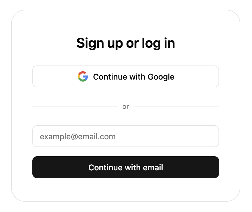
defaultTheme.
Dark theme
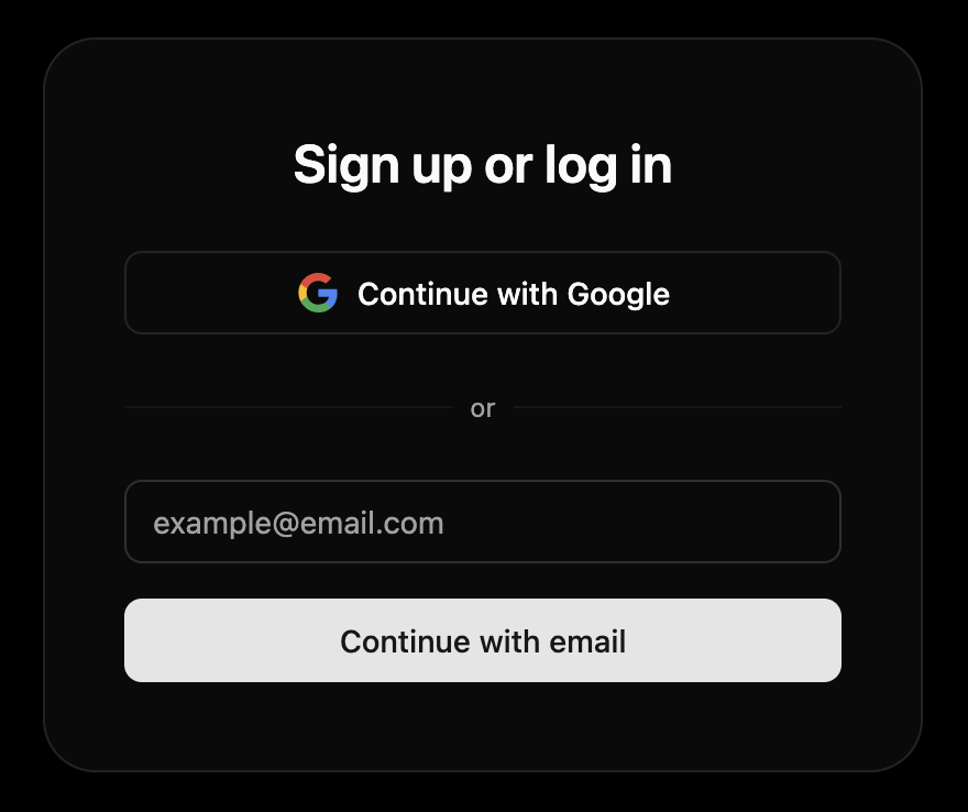
defaultDarkTheme.
shadcn theme
If you use shadcn/ui, you can useshadcnTheme to automatically match Stytch UI to your theme. Here are some examples of how Stytch UI appears with different shadcn/ui themes.
- Default
- Neobrutalism
- Bubblegum
- Amethyst dark
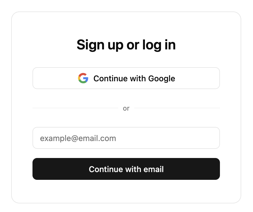
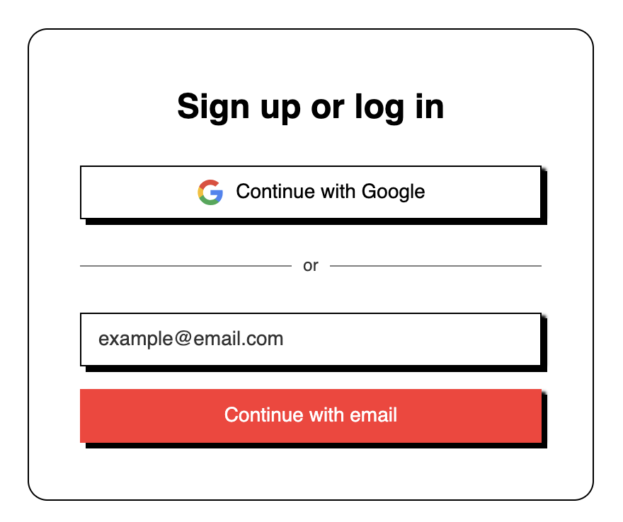
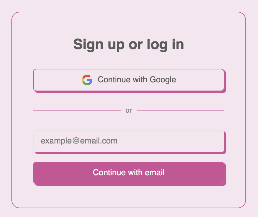
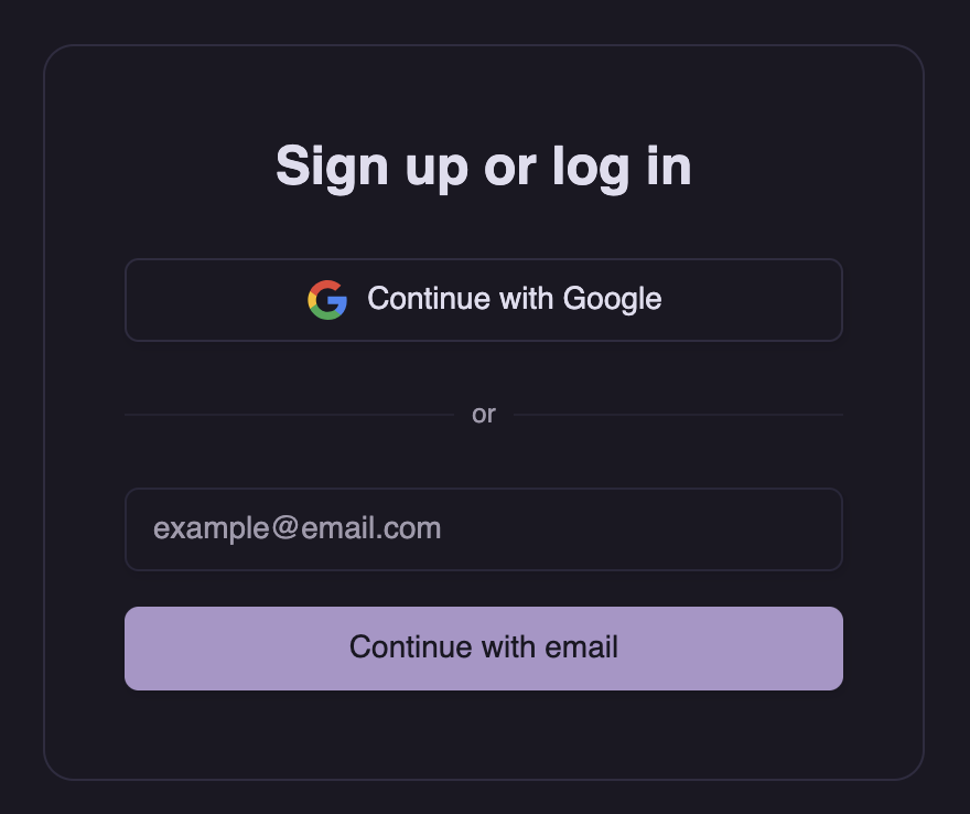
.dark class.
Customization
You can override any property in these theme objects. See the reference below for all available properties.Automatic light/dark themes
You can also provide an array of two themes, and Stytch UI will automatically switch between them based on the user’s OS color scheme.Creating your own theme
You can create your own theme using this template. The template contains the default value for each property. Feel free to delete any properties where you want to use the default.Additional properties
These properties are usually derived from base tokens but can be overridden if your theme needs different values.CSS variables
You can also use CSS custom properties (a.k.a. CSS variables) as values. This is useful if you are using Tailwind or another framework that provides them.TypeScript
Themes are typed asTheme. This object has every non-derived property marked as required. If you only intend to override a few properties from default, you can use Partial<Theme> instead.
Playground
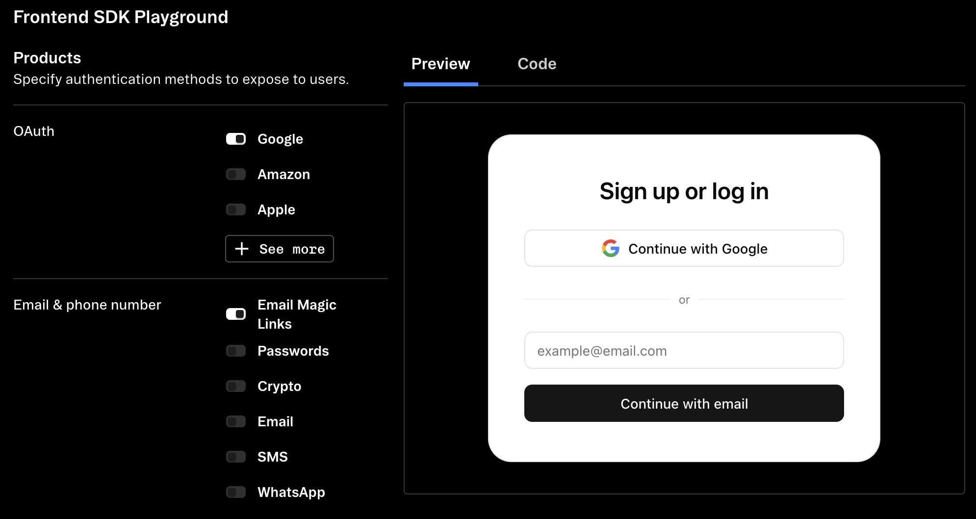
Use the dashboard SDK playground to preview and customize your config and theme.
Additional options
Logo and header customization
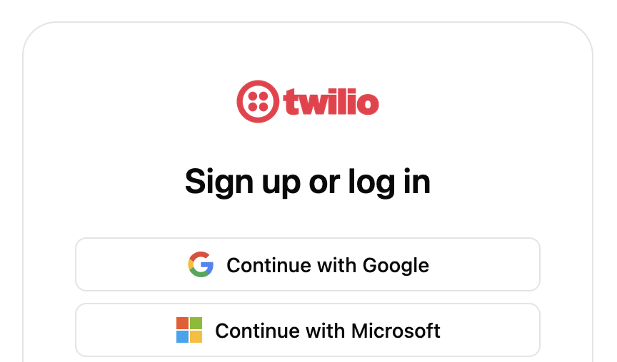
options.logo to configure the logo displayed at the top of the components. The logo will be resized to a maximum of 100×50px, but we recommend using an image at least 200×100px to support users with hi-dpi displays.
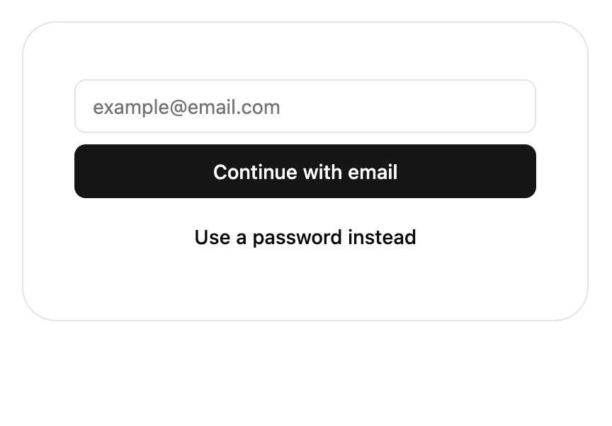
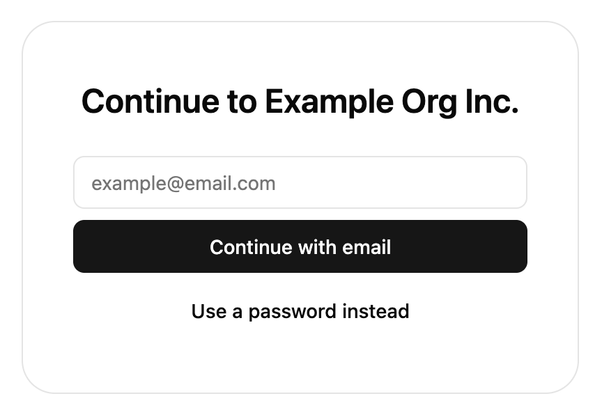
options.hideHeaderText to hide the heading and instruction text on some screens. This can be useful to avoid duplicating existing headings on the page and can be combined with setting theme['container-border'] to 0 to blend the components into the page.
- hideHeaderText
- Without hideHeaderText
Icon customization
Icons can be customized by passing an object topresentation.icons where the keys are icon IDs and the value is a React component (not element) rendering the icon.
A monochrome black and white logo set is available as an alternative to the default color one.
Currently, we only allow customizing logos used in OAuth, SSO, email, or crypto products. These logos can be customized:
- amazon
- apple
- bitbucket
- coinbase
- discord
- figma
- github
- gitlab
- microsoft
- salesforce
- slack
- snapchat
- tiktok
- twitch
- xTwitter
- yahoo
- phantom
- metamask
- binance
- gmail
- outlook
size prop and spread the rest of the props onto the root element.
Shadow DOM style isolation
Useoptions.enableShadowDOM to use shadow DOM to isolate outer page styles. Use this option if you find Stytch UI’s styling are being overrode by the page’s stylesheet. In @stytch/react and @stytch/nextjs, this will also create an additional wrapper <div> to act as the shadow root for the component.
Compatibility
Our themes use thecolor-mix CSS function and the oklch color space to generate variant colors. If you need to support older browsers that do not support either of these, use addColorFallback() imported from /compat to generate the colors in JavaScript instead.
TypeScript
Types are available for all parts ofpresentation.
Reference
presentation.theme
'light' | 'dark'
The color scheme for the theme.
string
default:"0.15s"
Duration for transitions.
Fonts
string
default:"system-ui"
Base font for all text.
string
default:"ui-monospace"
Font for monospace code, such as TOTP setup and recovery code.
string
Header font override. Defaults to base font-family.
Sizes
string
default:"4px"
Base sizing variable. Changing this makes most spacing between elements larger or smaller.
string
default:"400px"
Max width for outer container.
string
default:"768px"
UI components are larger to accommodate touch screens below this size.
string
default:"4px"
Base border radius.
string
default:"1rem (16px)"
Base font size.
string
Override for button border radius. Defaults to 2× rounded-base or 8px.
string
Override for input border radius. Defaults to 2× rounded-base or 8px.
string
Override for outer container border radius. Defaults to 6× rounded-base or 24px.
Shadows
string
Base box shadow, used for both buttons and inputs. Defaults to none.
string
Box shadow override for buttons.
string
Box shadow override for inputs.
Colors
string
Background color of the SDK container.
string
Default font color for text in the SDK container.
string
Your primary brand color. This will be applied to primary action buttons such as form submit buttons.
string
Text color contrasting with primary.
string
Your secondary brand color.
string
Text color contrasting with secondary.
string
A neutral, subtle color for areas such as the unfilled part of a progress bar.
string
Text color contrasting with muted, and also the color used for helper and other secondary text.
string
Your accent brand color. This will be applied to backgrounds to draw the user’s attention, such as the backup code for TOTP registration.
string
Text color contrasting with accent.
string
Border color for the outer container and dividers.
string
Border color for inputs.
string
Input and button focus ring color.
string
Background and font color for destructive actions and error states. Defaults to red.
string
Text color contrasting with destructive.
string
Background and font color for warning states. Defaults to dark yellow.
string
Background and font color for successful states. Defaults to green.
string
Border color only for the outer container. Defaults to the value of border.
presentation.options
The presentation.options object customizes non-style-related aspects of the SDK’s appearance.
You can specify some of them or none at all. We’ll use our defaults for the ones you don’t specify.
boolean
When this value is true, the title and description text will not show in the SDK.
object
The configuration object for your custom logo.
boolean
When true, the UI components will mount itself in a shadow DOM. In
@stytch/vanilla-js, use the shadow attribute on the custom elements or the { shadow: true } option on the component constructor instead of this option. This defaults to false.