Back to blog
Behind the scenes with Vessel: designing a brand for the first-ever passport for the internet
Product
May 16, 2022
Author: Stytch Team
Vessel is a secure browser extension that works as a digital identity and multi-chain wallet rolled into one.
In simpler terms, that means instead of users having to set up and enter credentials (like a username and password) for each app or website they open, they’re logged in once through Vessel and can then “bring their own account” as they surf the web. That’s why we refer to it as a passport for the internet.
As an exciting new entry into Web3, we knew we needed to differentiate Vessel from Stytch’s core brand and platform of passwordless authentication solutions for developers. And that presented new challenges for our design team.
For one thing, Web3 is a complex space. Many new users find the concept of decentralized auth difficult to understand, and it’s a design team’s job to make the process look and feel as welcoming as possible. For another, designing for Stytch means designing for businesses—usually a specialized team of engineers. Vessel, on the other hand, is a consumer product intended for a broad audience.
In this post, we share how we navigated this new terrain to develop an approachable, accessible brand in a particularly intimidating space—and introduce the dynamic brand assets we created.
Picking the perfect name
Stytch’s founders, Reed and Julianna, picked the name Vessel from hundreds of possibilities brainstormed by a cross-functional team of product managers, designers, engineers, and marketing specialists.
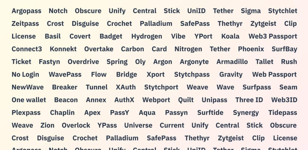
Snapshot of names brainstormed
As a word, “vessel” evokes something that transports passengers across different environments and—like a passport—provides them with secure access to new experiences.
Having a powerful name in place at the outset of our branding initiative gave us a clear sense of direction and helped us organize our efforts around a cohesive theme that could guide the rest of our designs.
Setting the mood
As with most branding projects, the story behind Vessel’s visual style begins with a mood board—a collage of the different images, typefaces, and other design elements that shape a brand’s color palette, logo, and wordmark.
As a tech-forward market, Web3 products tend to use developer-friendly “dark mode” tones, 3D illustrations, and ultramodern imagery. But we wanted Vessel to appeal to seasoned Web3 users and newcomers alike. That meant balancing innovative, futuristic elements with more recognizable, everyday aesthetics.
Accordingly, we put together three visual spreads, which we titled Professional Futurism, Vaporwave Chic, and Bold Brutalism. In each batch, we worked to set fun, sci-fi inspired images against the professionalism, reliability, and security expected of an authentication platform.

From left to right: Professional Futurism, Vaporwave Chic, Bold Brutalism
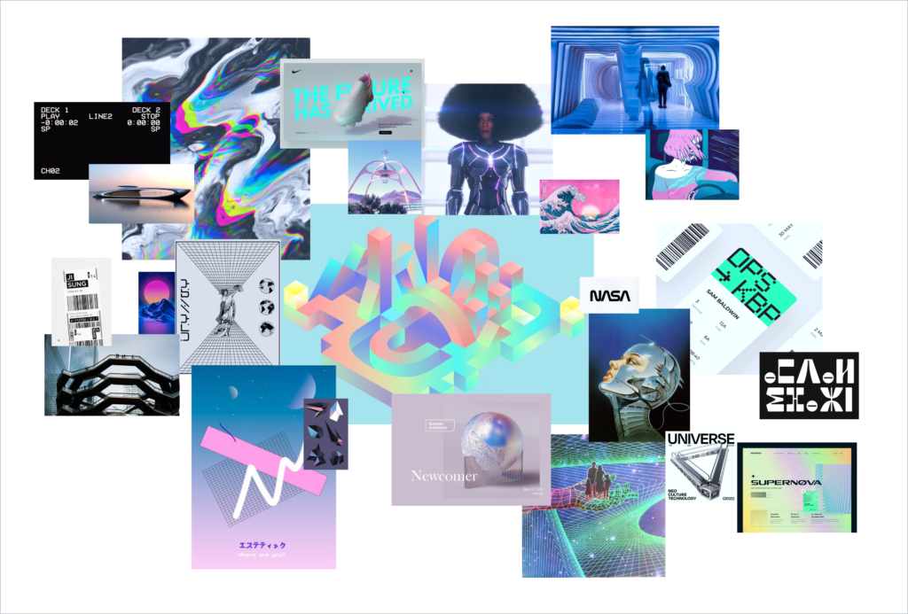
Final mood board
Finally, we combined these collections into a final, multidimensional mood board that would serve as a north star to guide the rest of Vessel’s branding. When it comes to a final mood board, our philosophy is that it's okay to deviate a bit and let the brand’s look and feel come together organically. To us, mood boards are a jumping off point—helpful guidelines, rather than strict rules.
Adding a touch of color
A color palette is one of the primary ways a brand sets a visual tone, elicits emotional responses, and engages its audience.
The three initial palettes we came up with for Vessel took inspiration from our mood board, each pulling in unique color combinations to test their compatibility. We also applied these colors to a number of assets so we could see how they would look and feel in practice.
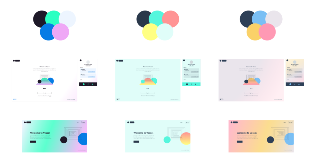
Exploring color palettes
Actually seeing the colors in true-to-life examples helped us to zero in on the middle option for Vessel’s palette. In a Web3 landscape typically dominated by darker blues, blacks, and purples, these colors felt fresh and playful—happy tones that remind viewers of a sunrise or sunset while staying true to the cool, modern tech foundations of the brand.
Landing on a logo
The name Vessel can have many different interpretations and lead in many different directions, from nautical voyages to aerospace exploration to circuitry and circulation.
We wanted the logo to convey both travel and communication, speaking to an industry and audience that are between two worlds—that is, between Web2 and Web3, the known and the unknown—while staying firmly grounded in familiar, comfortable graphics.
We played with many possible logos, including a space helmet, rocketship, and satellite, before ultimately deciding on a curvy sketch of a submarine using echolocation. We liked the idea of using deep sea navigation as a metaphor for discovery in the strange new realm of Web3—with the sonar helping explorers (like internet users) easily find their way.
For Vessel’s wordmark, we paired this logo with a strong, crisp font that adds a bit of gravity and a sharp, contemporary edge to the playfulness of the submarine.
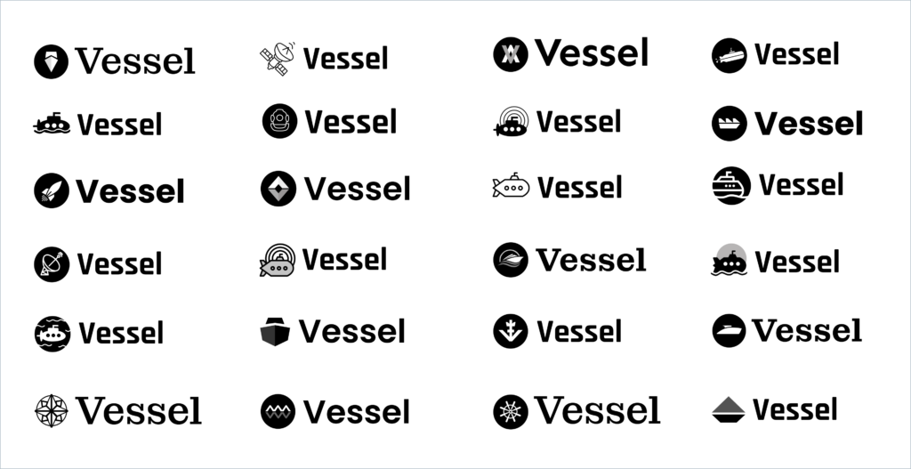
Exploring logos and wordmarks
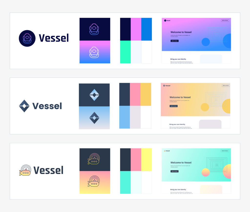
Three final directions
Putting it all together
With these design elements in place, the entire Stytch team could align around a vision for Vessel and begin building out the wireframes, user flows and experiences, and brand assets that would truly bring our product to life.
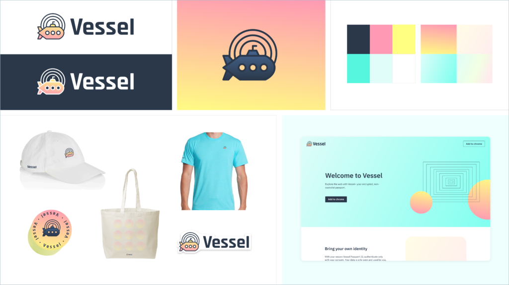
Final brand look and feel
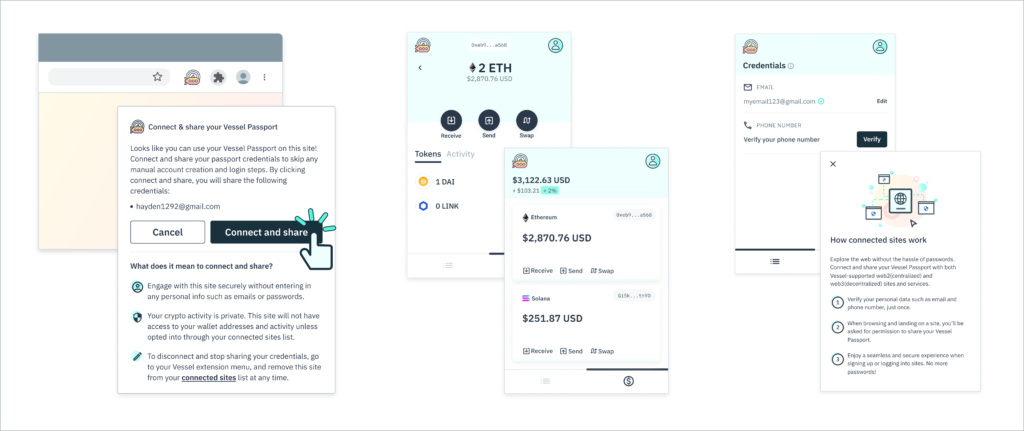
Applying the brand look and feel to the product
Working in the uncharted, unconventional space of Web3 and tackling new creative challenges allowed us as designers to think outside the box and develop a pioneering, tech-forward brand that’s still simple and accessible for beginners to grasp.
Get onboard with Vessel
We’re proud to release Vessel as a first-of-its-kind solution that will help eliminate friction on the internet and make Web3 accessible to more people online.
You can learn more about Vessel here. Or, if you’re ready to dive right in, you can download the extension for free at the Chrome web store and check out Vessel’s GitHub repositories to get quick support, enable your site, and become part of the Vessel connected network.
Don’t forget to share your feedback through our Vessel research survey—we’re excited to hear what you think and keep building toward a better, stronger online experience.
Build auth with Stytch
Pricing that scales with you • No feature gating • All of the auth solutions you need plus fraud & risk
Authentication & Authorization
Fraud & Risk Prevention
© 2020-2026 Stytch. All rights reserved.
