Back to blog
Rebranding Stytch: A new look for the future of auth and security
Company
Feb 15, 2025
Author: Aiden Forrest
Rebranding is much more than just a fresh coat of paint or a shiny new logo—it’s a reflection of where a company has been, where it’s going, and most importantly, how it wants to connect with the people it serves. For Stytch, our recent rebrand represents a step forward not just in design, but in our mission to make authentication simple, secure, and more scalable for everyone. Here’s a look behind the scenes of our rebranding journey and why we believe it’s a milestone worth sharing.
Why rebrand, and why now?
Since our founding in 2020, Stytch has evolved from a startup tackling core authentication challenges to a platform powering critical infrastructure for some of the world’s most innovative companies. As our products, customers, and ambitions have grown, it became clear that our brand needed to capture the breadth of what Stytch has become and the bold vision we have for the future.
We’ve since launched a multi-tenant B2B auth platform with features like SCIM and SSO, an advanced bot and fraud prevention suite, and granular authorization. Our customer base now ranges from startups to enterprise-scale companies like HubSpot, Calendly, Groq, Workday, and Zapier.
Our rebrand comes at a pivotal time in the industry. Businesses and developers are demanding more flexible, user-friendly authentication solutions, while users are increasingly wary of security risks and data privacy concerns. As AI and the rise of agentic workflows reshape our industry and the threat landscape, we’re preparing for even more rapid change. Over the coming week (and year), you’ll see us launch exciting new technologies to help developers address evolving security requirements and scale their applications with ease amidst this technological evolution.
Our new brand is designed to reflect our commitment to meeting these challenges head-on, with clarity, confidence, and care.
Defining the core of Stytch’s identity
Before diving into colors, fonts, or logos, we started with the most important question: What does Stytch stand for? Through workshops, interviews, and feedback sessions with our team and branding agency, Fuzzco, we distilled our brand essence into three key values:
- Empowering engineering excellence: Stytch provides software engineers with the infrastructure to secure applications with the expertise of the world’s best authentication specialists, offering tools that are straightforward to integrate while abstracting away complexity.
- Redefining expectations for identity solutions: We aim to set a new benchmark for authentication infrastructure by eliminating engineering frustrations and technical debt, enabling teams to focus on building innovative applications and exceptional user experiences without having to worry about protecting their users and accounts.
- Adaptable and evolving solutions: Stytch delivers an authentication experience that feels like having a dedicated group of identity and security experts embedded on your team—solutions that adapt and scale with your needs while ensuring you remain ahead in a rapidly evolving threat landscape.
These values guided every decision we made during the rebranding process, ensuring the final result was authentic and aligned with our purpose.
The creative journey
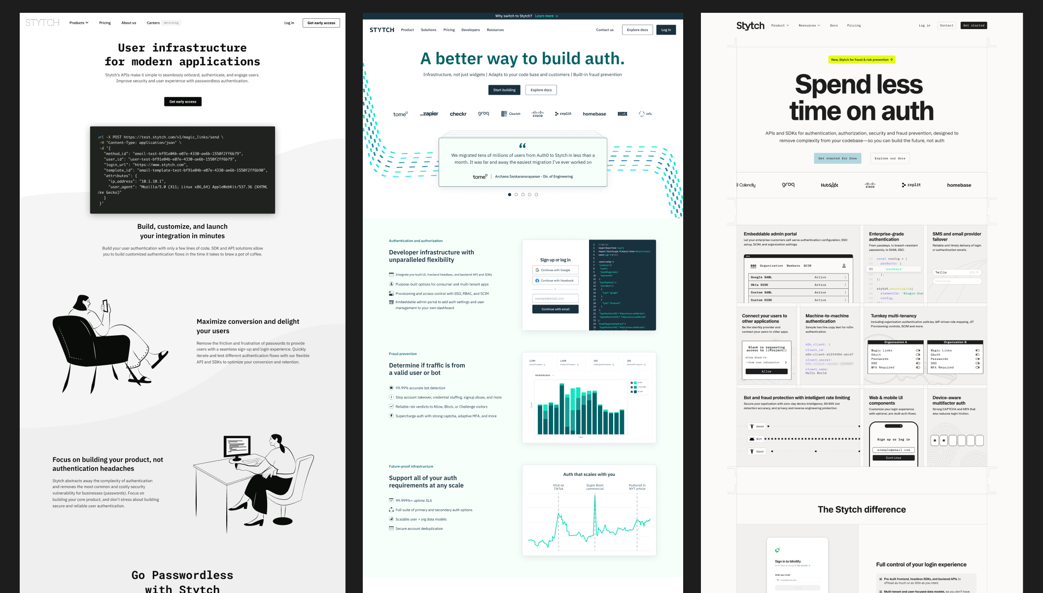
At Stytch, design is central to our mission to make auth and security simpler and more scalable. From structuring APIs to guiding workflows in our Dashboard and simplifying technical concepts in our docs, every element is crafted to make authentication and security more intuitive for developers.
Our new identity reflects our evolution into a comprehensive security platform capable of handling mission-critical needs while fostering innovation and a stellar developer experience. We explored numerous directions before finalizing a visual and verbal identity that feels distinctly “Stytch.”
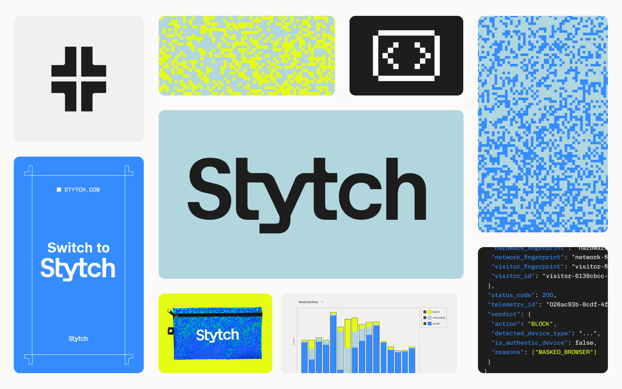
Icon and wordmark: Embodying security and seamless integration
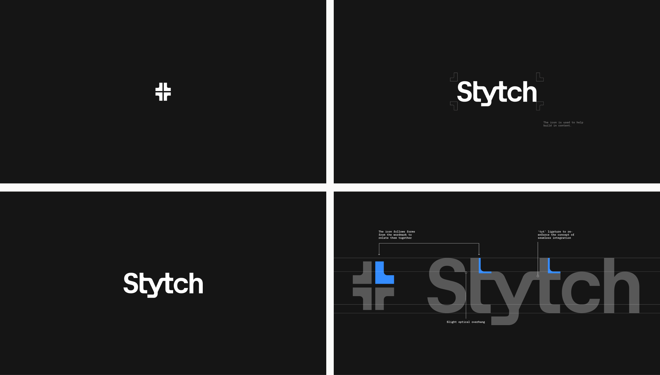
Icon: When we launched Stytch, we intentionally omitted an icon to focus on building brand recognition around the name "Stytch." However, as we’ve grown, the need for a distinct symbol has become clear—particularly for small visual spaces where the full wordmark isn’t practical.
Our new icon draws directly from the forms in the wordmark, creating a cohesive connection between the two. The interlocking shapes embody trust, security, and adaptability while also serving as a versatile framing device for content.
Wordmark: We refined the wordmark by reverting to title case and tightening the kerning, bringing the letters closer together. This design choice emphasizes the idea of seamlessness and reflects our commitment to delivering tools that integrate effortlessly into developers’ workflows.
Typography: Balancing boldness and functionality
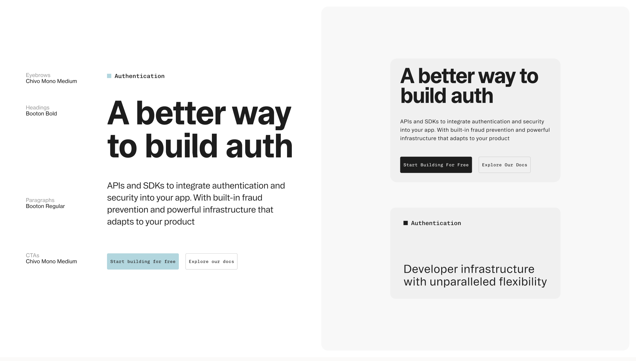
When selecting Booton and Chivo as our brand typefaces, we aimed to strike a balance between sophistication, boldness, and approachability. Booton, a refined sans-serif, serves as the cornerstone for headlines and body copy, ensuring clarity and impact. To complement it, we chose a monospace font—a subtle nod to our developer audience—that adds interest and character in smaller text moments, reflecting the technical precision at the heart of Stytch.
Colors and pattern: Stitching together sophistication, innovation, and 8-bit
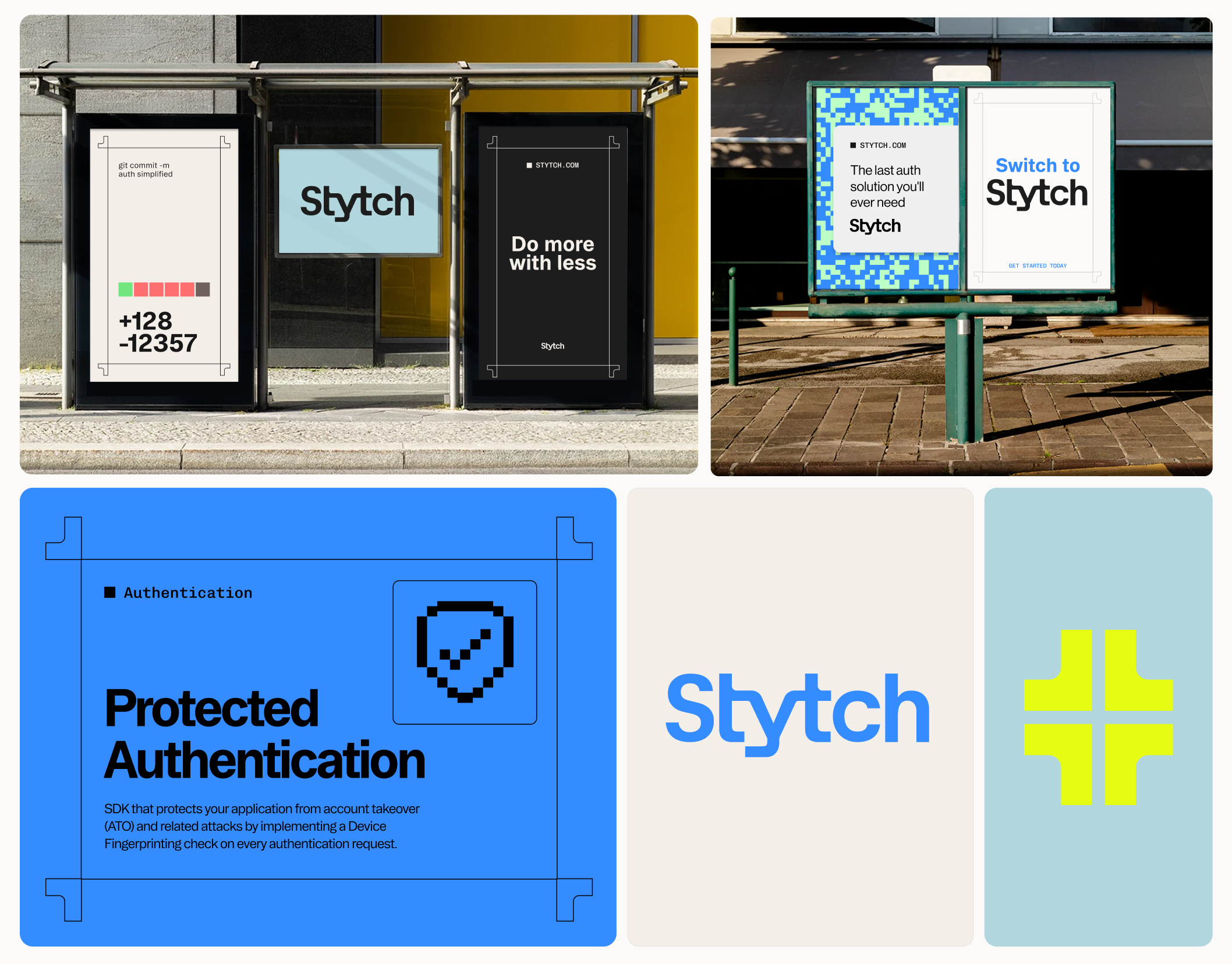
Our new color palette strikes a balance between sophistication and innovation. Anchored in black, white, and blues, it communicates technical expertise, polish, and security. To complement this foundation, we introduced a vibrant secondary palette that adds energy and optimism when needed. This duality captures the essence of Stytch—serious and secure, yet fresh and forward-thinking.
Our pixel pattern incorporates the full palette, creating dynamic, branded backgrounds for marketing materials. It’s not just a design element but a reflection of our approach: adaptable, structured, and uniquely Stytch.
Framing device: protection at every corner
As part of our new identity, we developed a framing device derived from our icon, embodying the protective essence of Stytch. The framing device serves dual purposes, functioning dynamically in motion and statically for content framing.
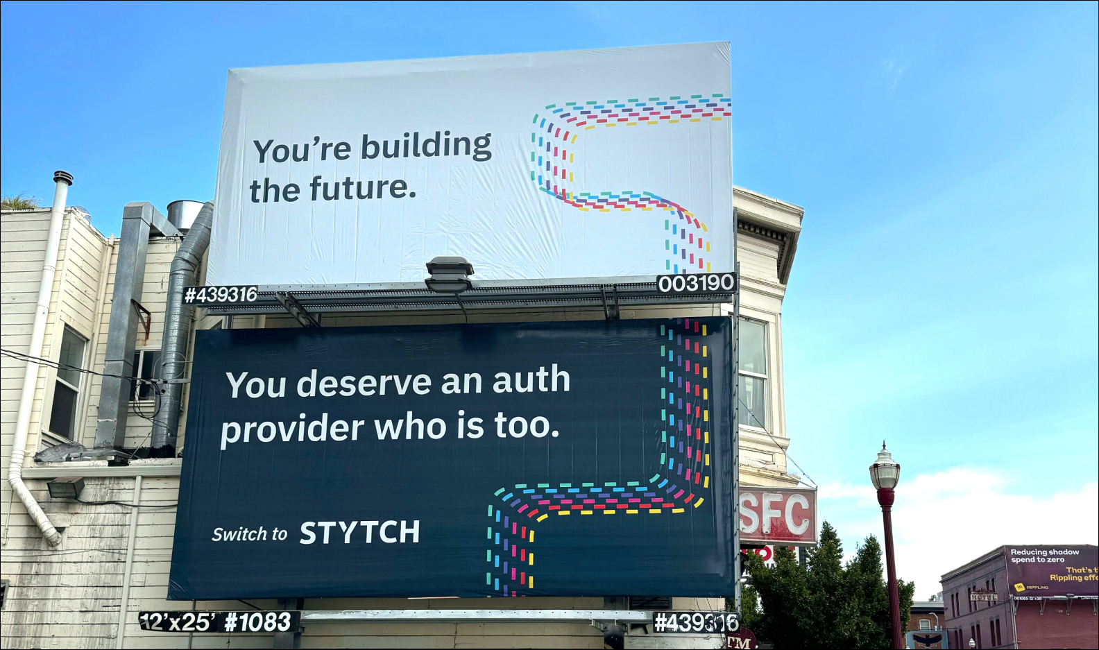
In motion, the frame guides attention by drawing content on and off the screen, creating fluid transitions that feel deliberate and seamless. In static applications, it acts as a structured border, ideal for highlighting content in social media and out-of-home (OOH) marketing. This versatile element reinforces our commitment to security and adaptability, providing a visually distinct and cohesive design language that ties back to our core identity.
Icons and illustrations: Blending past and present
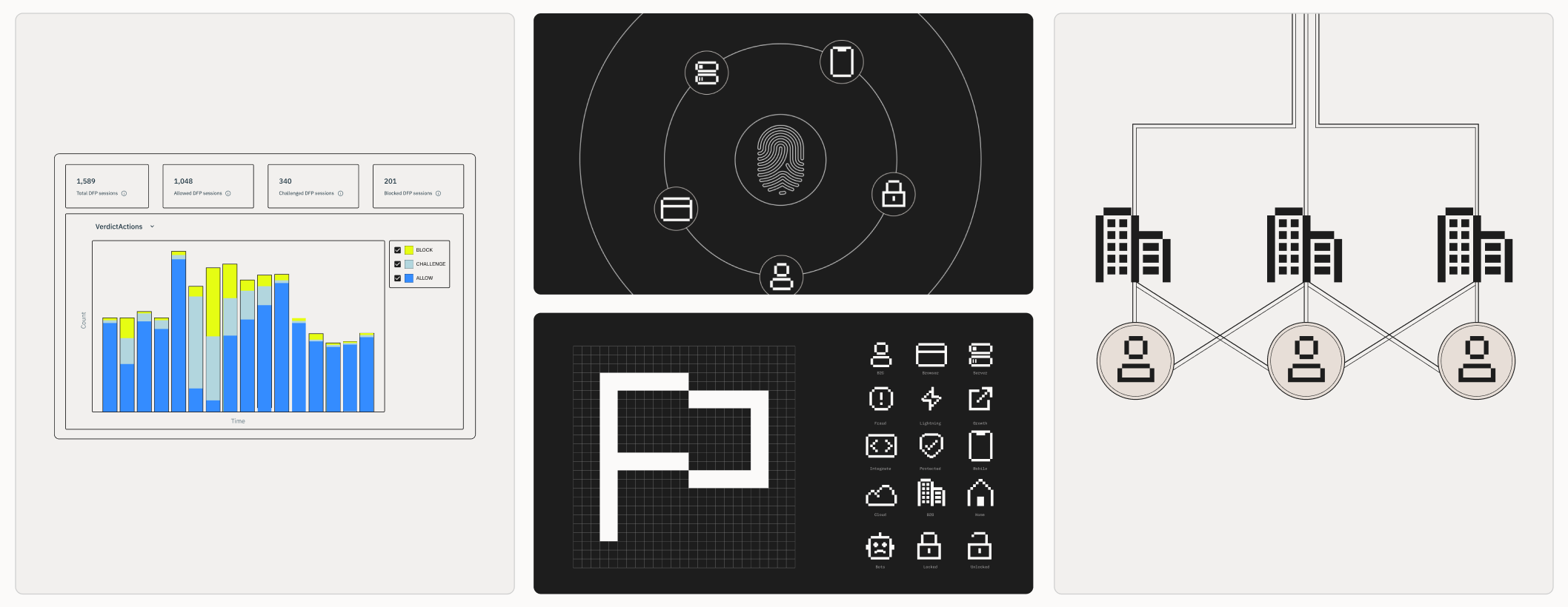
To complement our pixel pattern, we’ve designed a suite of pixel icons that seamlessly integrate across our marketing site and documentation. These icons create a cohesive visual bridge between our product and marketing materials, ensuring a unified experience.
Our illustrations take a modern, technical approach, resembling schematic blueprints that highlight precision and clarity. The balance between the bold, structured pixel icons and the lighter, line-based illustrations introduces an intentional contrast that reflects our brand's duality—grounded in technical expertise yet innovative and forward-looking. This visual tension enhances the cohesiveness of our design system, embodying Stytch’s commitment to blending the functional with the creative.
Beyond aesthetic: What this means for our customers
While the visual refresh is exciting, the most important aspect of our rebrand is what it enables for our users. Here’s what you can expect:
- Enhanced clarity: Our new website and documentation are designed to make it easier than ever to explore, understand, and implement Stytch’s solutions.
- A unified experience: From our developer Dashboard to our customer support interactions, the new brand creates a cohesive and intuitive experience at every touchpoint.
- Reinforced trust: Our updated messaging and design emphasize our commitment to security and reliability, giving users greater confidence in choosing Stytch.
Looking ahead
Rebranding is just the beginning. As we continue to innovate and expand our offerings, our new identity will serve as a foundation for growth and a reminder of our mission. We’re incredibly proud of how far we’ve come, and we’re even more excited for what’s ahead. Thank you to our customers, partners, and team for being a part of this journey.
Explore our new website and docs. Or sign in to see our new Dashboard.
Stay tuned for Launch Week starting Feb 18, where we’ll unveil exciting new features to help you build the future of authentication and security. Follow us on X for daily product announcements.
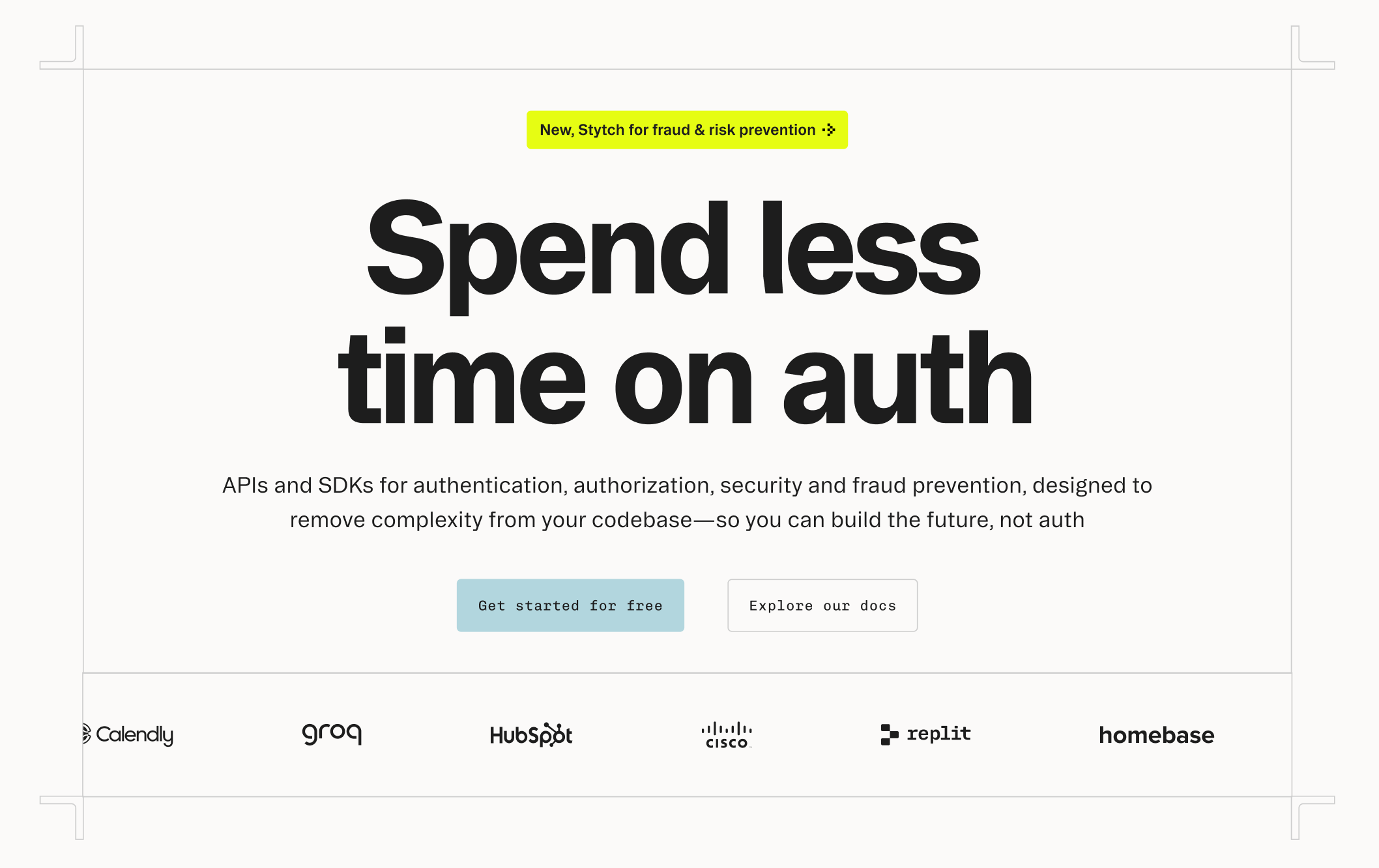
Build with Stytch
APIs and SDKs for authentication, authorization, security and fraud prevention
Authentication & Authorization
Fraud & Risk Prevention
© 2020-2026 Stytch. All rights reserved.